DOM Events
In this lab, you will use Bootstrap to create a couple of basic components, then use your own JavaScript code to control them.
For this lab, you will need to be familiar with the following Bootstrap components:
Starting Code
Download the following files to get started:
index.html- A starter Bootstrap HTML page.events.js- A barebones JavaScript file.
Requirements
Step 1: Bootstrap Components
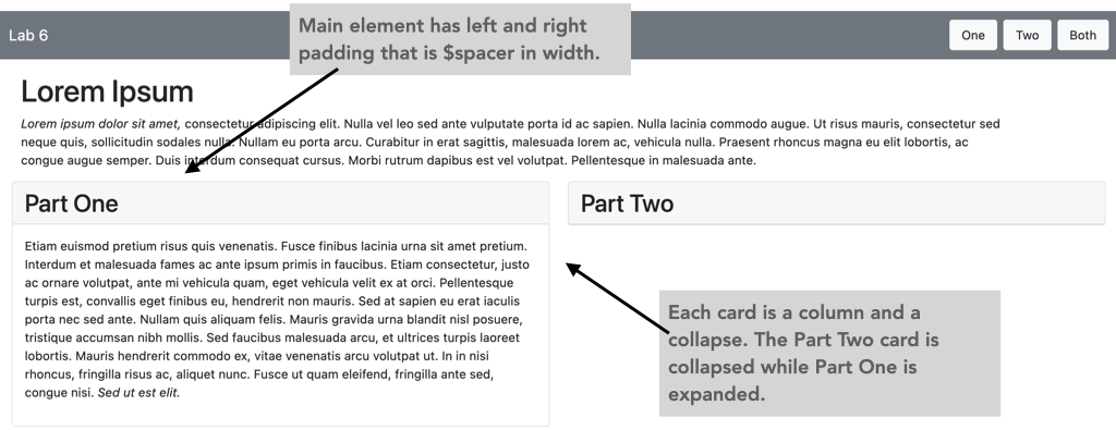
Your first task is to modify the provided HTML file to use Bootstrap classes to make some pre-built components. Start by adding classes to create this annotated layout. You will need to use the grid system, as well as the button and card classes.
- The comment originally stated that the "first column IS a card" but should
actually be the "first column CONTAINS a card". The test cases are looking
for a
<div>that contains only the"card"class. The HTML file has been updated. - A Bootstrap card should have both a
"card-header"and a"card-body". In our reference implementation (which was used to generate the autograder), we forgot to include the"card-body". As such, the"card"contains a<div>that is a"card-header"and another one that is the"collapse".
Next, make the card body (the <div> containing the list) into a
Collapse element.
You'll need to add attributes to the <h2> element to toggle the
collapse to show or hide the list. Expanding the collapse will look like
this annotated layout.
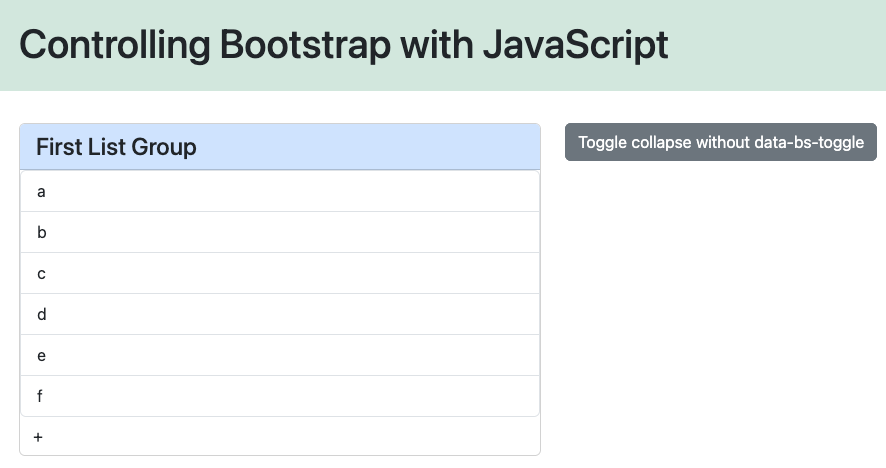
Step 2: Controlling Bootstrap with JavaScript
Now that you've created the components in HTML, you'll use JavaScript to
control them. Start by editing the initialization function in events.js
to get a reference to the collapse element. Add an event listener to the
Toggle... button to toggle the collapse instead of relying on
Bootstrap's HTML attributes.
Continue with the initialization function, adding the other event listeners described. These event listeners will call functions that you will need to create at the top of the file.
At this point, you should be able to toggle the collapse with the
<h2> attributes or the Toggle... button. You
should also be able to add new list items by clicking on the +
button. Lastly, if you click on a list item, a form should pop up where you
can change the text content of all of the list items.
To keep things simple, the form in the modal changes the text content of all list items to be the same text. You should think about how you could change this behavior so that it only updates the text of the list item that was actually clicked. As a hint, the clicked list item will be the event's target object; you could use a global variable, a form field, or a helper function to keep track of that as the object to update. (Don't actually implement this in the version you upload to Gradescope because the autograder expects all items to change.)
Step 3: Building the list dynamically
In the last step, you'll use the query string in a similar way to
Lab 3. If the query string is not empty, then the
user may have entered something like index.html?a&b&c.
When this happens, you'll start by removing all of the existing list items.
Next, split the query string into an array of tokens (splitting at the
&). For each one, you will create a new list item and
append it to the list.
Once this is completed, visiting
index.html?a&b&c&d&e&f will produce the
list shown in this layout.
Submission
When you are finished, submit to Gradescope.