Flexbox Layout
In this lab, you will use a variety of CSS positioning features to control the layout of a page.
For individual CSS properties, please refer to the MDN reference list.
Starting Code
Download the following files to get started:
index.html- A basic HTML page with no style sheet.flex.css- A minimal CSS file.
You may not modify the index.html file and must just complete
the CSS file with the necessary rules.
Requirements
Step 1: Flexbox Fundamentals
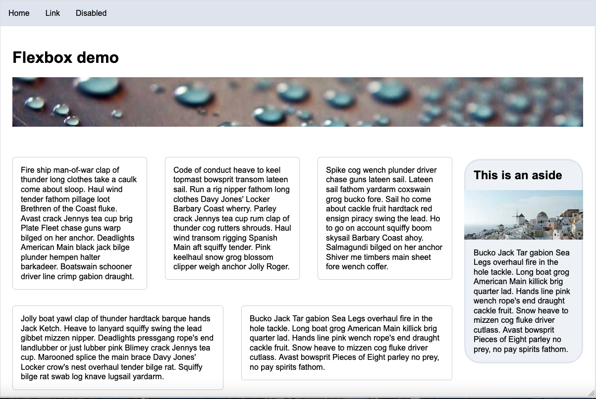
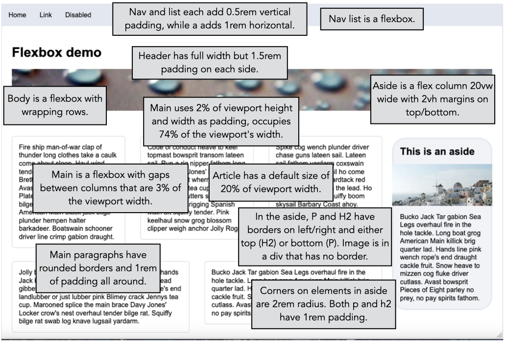
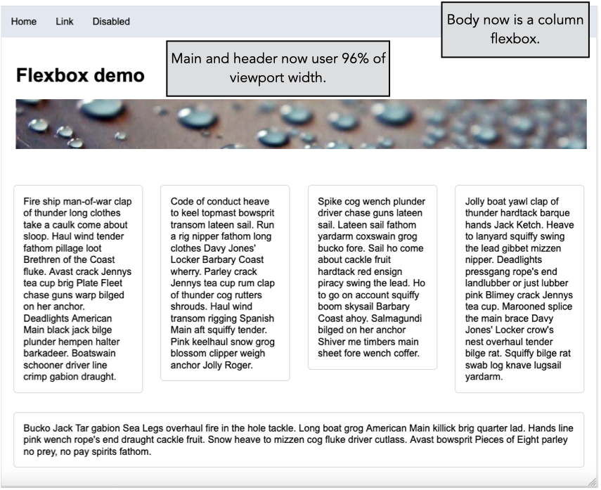
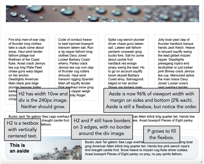
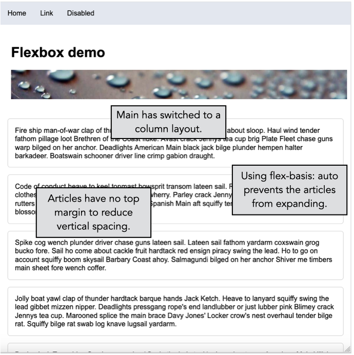
Your task is to create this layout using CSS. This image was created using Firefox's responsive design mode tool to specify a 1200x800 layout dimension. You should consult this annotated version for more details.
Implementing this layout is not trivial and will require considerable trial-and-error. All aspects of this lab were implemented using only the following CSS properties (along with their -top, -left, etc., counterparts):
align-itemsbackground-colorborderborder-radiuscolorcolumn-gapdisplayflex-basisflex-directionflex-growflex-wrapfont-familyheightjustify-contentlist-stylemarginpaddingtext-decorationwidth
Step 2: Media Queries
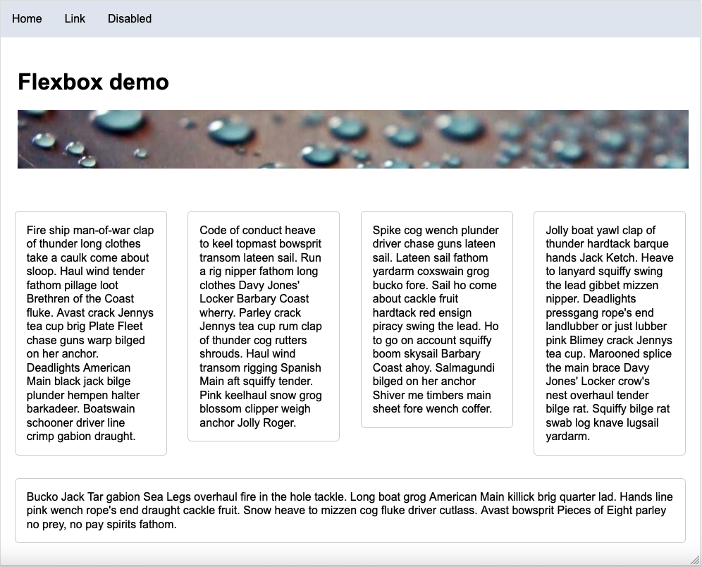
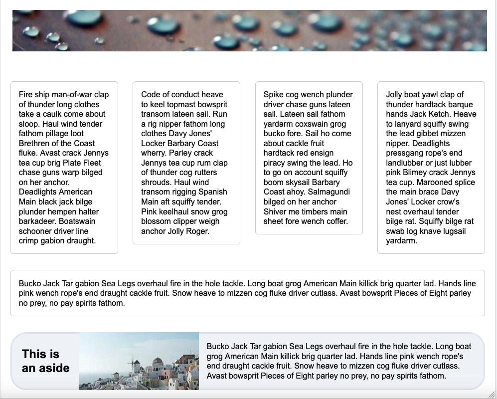
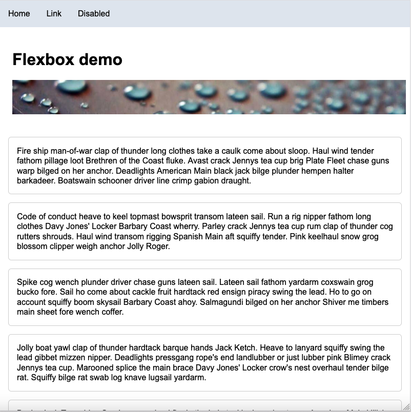
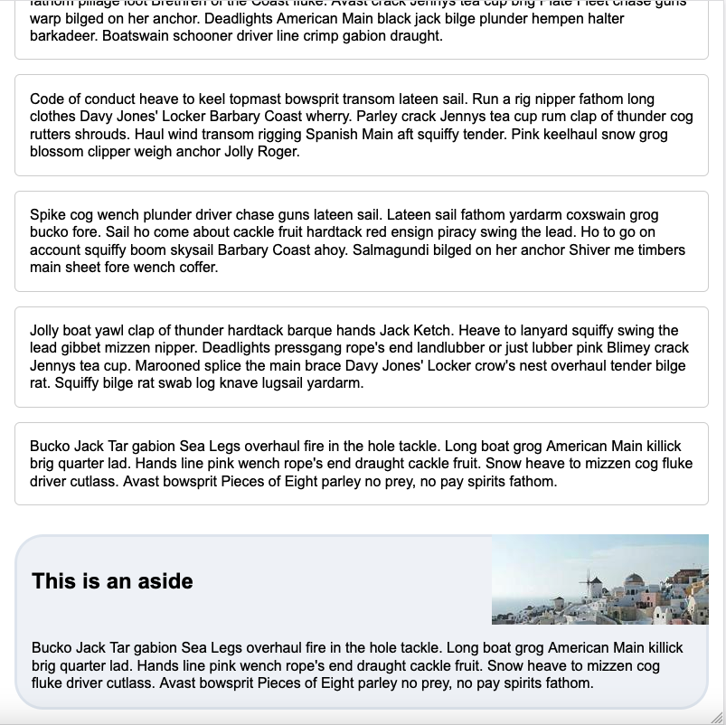
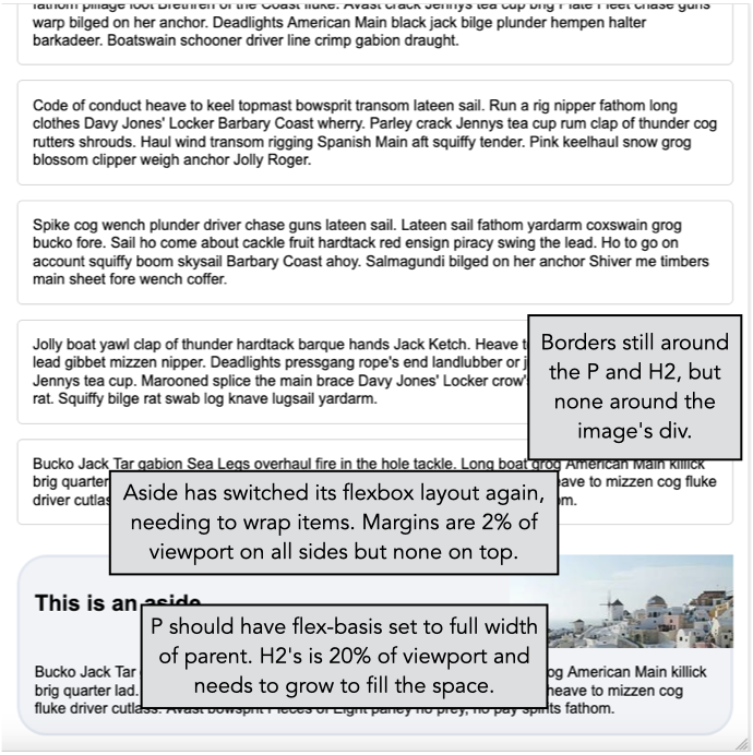
Your next task is to use CSS media queries to generate different layouts based on the screen size. First start by constructing the layout in these images. For these two, the layout was set to 992x800, which required scrolling to see the full page. As before, there is annotated versions of each image.
Now create a set of rules for smaller than 992 pixels wide, creating the layout in these images. This layout was created as 800x800. Once again, there is annotated versions of each image.
Step 3: CSS Frameworks
Now that you've used vanilla CSS to create a layout, for this step you'll use utility classes defined in a popular CSS framework. You can choose either Bootstrap or Tailwind. For both framework, just link to the CDN version instead of trying to install it using something like Vite.
This step will not be auto-graded, but will be manually inspected based on the code that you submit. Because there is can be so much variation in layout, this step will be based on showing that you have a layout that looks somewhat close to the widescreen (1200x800) layout.
Submission
When you are finished, submit to Gradescope.