Prep 6: Holy Grail Layouts
Due: Wednesday, Mar 5th
Read
- 7.3 Grid Layout
- 7.4 Responsive Design
- 4.8.1 What is a CSS Framework?
Write
Submit four screenshots to Gradescope:
-
Implement the "Holy Grail" of web layouts as guided by Dr. Johnson.
- Take a screenshot of the final result in your web browser.
- Notice this approach uses Flexbox (not Grid or Bootstrap).
-
Implement the "Holy Grail" in MDN's CSS grid layout reference.
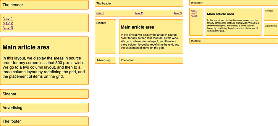
- Take a screenshot with a viewport width < 500px.
The layout should look like the left third of this image. - Take a screenshot with a viewport width >= 500px and < 700px.
The layout should look like the middle third of this image. - Take a screenshot with a viewport width >= 700px.
The layout should look like the right third of this image.
- Take a screenshot with a viewport width < 500px.
The MDN page has several other examples, but we're linking specifically to only one section of that page—the first section, with the heading: A responsive layout with 1 to 3 fluid columns using grid-template-areas.