Lab 7: Beyond Responsive Design with GTA4123
Overview
Building on their experiences on the recent prep, students will collaborate to add the following to a starting codebase:
- a new responsive “breakpoint” for a “tiny” viewport
- dark mode
- responsive images
- flow-relative layout
Starting Off
Work in pairs. Your instructor will tell you which of the choices below applies to you. Follow the corresponding starting instructions. (If you’re a trio, no worries. The Third is also legitimate, but for the next bit, they should follow the instructions for Gold Partner.)
- GitHub
- Purple Partner: click here to instantiate a github repo from the starting code for this assignment
- Purple Partner: In the repo’s Settings → Collaborators, click the
Add peoplebutton to add your partner - Gold Partner: Possibly check your github-connected email to accept the invitation
- GitHub Classroom
- Purple Partner: agree with Gold Partner on a name for your team
- Purple Partner: follow the link from your instructor to accept the GitHub Classroom assignment and enter the team name on which you agreed
- Gold Partner: follow the link from your instructor to accept the GitHub Classroom assignment and choose the team Purple Partner just created.
Getting to know git 😬
If you’re feeling a little uncertain about your git skills, no worries! We know you’re learning. You got this. That being said, consider installing a GUI for git. Even if you prefer to learn the command line commands (which is ultimately the best long-term choice, but shouldn’t block you getting started), having a GUI to aid you in visualizing and confirming your understanding of the state of your repo is so helpful!
-
BOTH PARTNERS: clone the repo you just created (you should both be cloning the same repository)
-
you can clone from the command line or with vscode source control pane:
-
command line:
Prerequisite to command line git
To clone from the command line you should have already added an SSH key to github.
- find the clone url. see this screenshot:
- from a directory on your laptop (like your
343/lab/directory or similar), but ideally not from a directory that is already a git repository, rungit clone git@github.com....git - Proceed to step 2
- find the clone url. see this screenshot:
-
vscode source control panel
- In the left-most part of vscode there should be a sidebar with icons. The first icon shows pages and if you toggle it open it will show the heading
Explorerand it is a file explorer. - Click on the 3rd or 4th option which looks like a few nodes with a forking path between them
- Click on
Clone Repository, then in the pop-up chooseClone from GitHub. You may have to complete an authentication workflow with github. - in the resulting search dialog, if you don’t already see your new repo as an option, search for
lab-07and choose the repository - Next vscode will show a dialog to select the repository destination. Choose a place you’d like to put the starting code, ideally not within an existing repo. vscode is going to create a new directory with the name of your repo, so you likely don’t need to create a folder yourself, but just choose the folder that has other 343 activities in it (like
343/labs/). - Proceed to step 2
- In the left-most part of vscode there should be a sidebar with icons. The first icon shows pages and if you toggle it open it will show the heading
-
-
-
EACH PARTNER: On your laptop in your cloned directory, make a branch that you name as your EID, so like mine will be named
stewarmc- you are both doing this on our own computers, so you will each have the
mainbranch you cloned and then 1 more branch, named for your own eid. - You can do this in the
Source Controlview of vscode by hovering your mouse nearCHANGESand finding the ellipsis (...) and choosingBranch→Create Branch...or from the command line withgit switch -C yourEID
- you are both doing this on our own computers, so you will each have the
- EACH PARTNER: Push your new branch to the github repo in a remote branch with a matching name.
- You can do this in the
Source Controlview of vscode by hovering your mouse nearCHANGESand finding the ellipsis (...) and choosingBranch→Publish Branch...or from the command line withgit push origin yourEID
- You can do this in the
- BOTH PARTNERS: Review the code
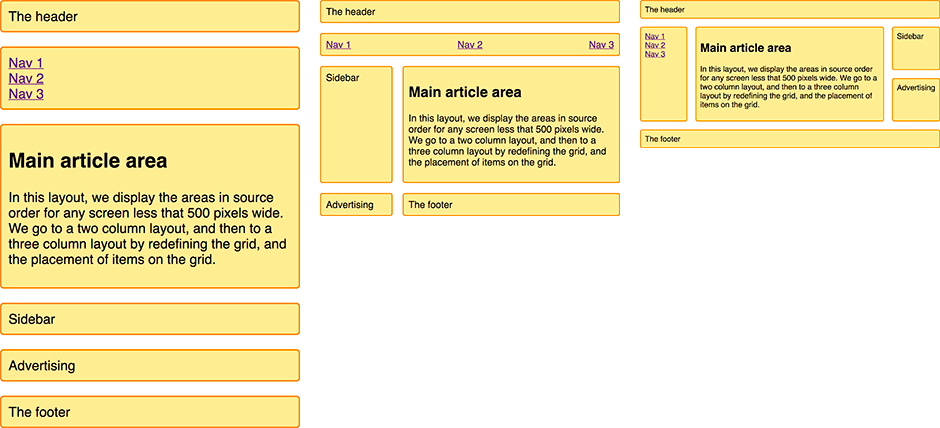
- The starting code implements a representative responsive layout as described in (JUST THE LINKED FIRST SECTION OF) Grid Template Areas “for” 1 “to” 3 fluid columns 😂 🏎️🚓 🤣.
- BOTH PARTNERS: Review the SECTION (not the whole page!) of the MDN Guide above.
- See the markup (
index.html) and css (styles/gta-mdn.css) in your repo. These files correspond to the guide. Confirm that the code works as expected. Discuss each file with your partner, and make sure you both understand the starter code.
- See the markup (
- BOTH PARTNERS: Review the sections below and edit the
Plansection ofREADME.mdto identify who will complete each part. (If you’re a pair, whoever finishes their part first can take the responsive images or you can work on it together; else if you’re a trio, the Third should do the responsive images part.)


Tiny Viewports
The MDN’s guide uses two “breakpoints” to distinguish three layouts for a page.
Add a third “breakpoint” to define a fourth layout for “tiny” viewports with a width <= 374px.
Did you know the original Gameboy screen was only 160px × 144px?!

Recent smart watch resolutions have been around 374px × 446px.
- Create a new CSS file named
tiny.cssand add it tostyles/. -
Edit
index.htmlto “link” the new stylesheet.This should be the only change you make to the html
Other than this single line addition to
index.html, the rest of your work for this part will be intiny.css. -
Add the new breakpoint and make it so that on tiny viewports, there is a single column and “main article area” is displayed first, followed only by the
nav. -
Commit and push your changes.
Opinionated Person shares their guidance on authoring commit messages
Use messages like the following:
chore: add Oyster build scriptdocs: explain hat wobblefeat: add beta sequencefix: remove broken confirmation messagerefactor: share logic between 4d3d3d3 and flarhgunnstowstyle: convert tabs to spacestest: ensure Tayne retains clothing
In your case, the commit message might be like:
feat: add tiny breakpoint
Dark Mode
- Create a new file called
dark.cssinstyles/. - Create a directory called
scripts/adjacent tostyles/. - Add a javascript file called
dark.jsto the new directory. - Add a script tag to the bottom of the body of the html file that loads your new script.
-
Edit your
index.htmlto include a link todark.cssin theheadof the document just before it links tobasic.cssThis should be the only change you make to the html
Other than these two 1-line additions to
index.html, the rest of your work will be indark.cssanddark.js -
Edit
dark.csssuch that if the user has a “dark” preference, the page will be styled with a dark theme.- What the dark color scheme should be is your choice!
- If you’re not feeling creative set the background of the whole page to black and the text color of the content of the whole page to white.
- Else, do something nice (maybe with a slightly lower contrast than the above suggestion, see the JMU CS Colors on the wiki or try out these color resources:
How do I test the color scheme preference?
😉 This is in the DevTools video from earlier in the semester, but in the interest of time…
Pop over here for a few secs.
- What the dark color scheme should be is your choice!
-
in
dark.js, add an event listener such that when the user clicks any of the 3 nav items, the page will render with the selected color scheme.Dynamic Styling
Most often, dynamic styling is best implemented via:
- defining style rules for corresponding classes in css
- adding/removing classes to the necessary elements via js when needed
-
Commit and push your changes.
Responsive Images
This part requires changes only to your index.html
The previous two parts are primarily working in files referenced from index.html, but this part is implemented in index.html.
That goes for both of its sub-parts.
The following sub-parts require you to implement two forms of responsive images. The prep reading on Implementing Responsive Images in HTML is an important prerequisite to these sub-parts.
Resolution Switching
Add an image to the page such that the browser will dynamically choose different a different source for the image based on the device’s capabilities (pixel density). The result is that it should look the same on devices with different pixel densities (but “sharper” on those with higher pixel densities).
- Add a new
<paragraph>to the main article area. - Add an
<img>that shows Dr. Bowers’s circle-packing rendering of King Hall, but use resolution-switching to show the correct one for the device’s pixel density.
| pixel density | file |
|---|---|
| 1x | https://w3.cs.jmu.edu/cs343/s26/lab/07/assets/bowers-KH-circles-750x250.png |
| 2x | https://w3.cs.jmu.edu/cs343/s26/lab/07/assets/bowers-KH-circles-375x125.png |
| 3x | https://w3.cs.jmu.edu/cs343/s26/lab/07/assets/bowers-KH-circles-1125x375.png |
| 4x | https://w3.cs.jmu.edu/cs343/s26/lab/07/assets/bowers-KH-circles-1500x500.png |
Art Direction
Add an image to the page such that the browser will dynamically choose different a different source for the image based on the viewport size (width). The result is that the image should be different in different viewport sizes, in this case, different regions of the largest image are cropped for display on different sized viewports.
- Add second new
<parapgraph>to the main article area. - Add a
<picture>to the new paragraph.- Depending on the viewport’s width, an entirely different image should be shown, per the table below:
| min-width | file |
|---|---|
| 414 | https://w3.cs.jmu.edu/cs343/s26/lab/07/assets/250505-ECDS-SteveAderton-mobile-portrait-1to1.jpg |
| 896 | https://w3.cs.jmu.edu/cs343/s26/lab/07/assets/250505-ECDS-SteveAderton-mobile-landscape-1to1.jpg |
| 1242 | https://w3.cs.jmu.edu/cs343/s26/lab/07/assets/250505-ECDS-SteveAderton-mobile-portrait.jpg |
| 1620 | https://w3.cs.jmu.edu/cs343/s26/lab/07/assets/250505-ECDS-SteveAderton-tablet-portrait.jpg |
| 2448 | https://w3.cs.jmu.edu/cs343/s26/lab/07/assets/250505-ECDS-SteveAderton-mobile-landscape.jpg |
| 3240 | https://w3.cs.jmu.edu/cs343/s26/lab/07/assets/250505-ECDS-SteveAderton-tablet-landscape.jpg |
| 5242 | https://w3.cs.jmu.edu/cs343/s26/lab/07/assets/250505-ECDS-SteveAderton-full.jpg |
Commit and push your changes.
Flow-Relative Layout
The responsive layout we’re working with in this lab (see illustration below), is hard-coded to best support sites where their content is written in languages that start at the top left and first proceed to the right until moving down to the next line of content, but there are several other writing-modes.
Create a new css file in styles/ named i18n.css.
In that file, make a few rules for the whole document.
Set a few of the related properties: the writing-mode, direction, and text-orientation to some of thees combinations and see the resulting layout.
- for اللغة العربية (arabic), השפה העברית (hebrew):
direction: rtl; - for 한국어 (korean), 日本語 (japanese):
writing-mode: vertical-rl;
text-orientation: upright;
What is necessary to change about your grid to adjust to the other writing modes?
Do you read or write a language with a different writing mode? How sensible is this approach to changing the layout for the direction of the language?