This is the multi-page printable view of this section. Click here to print.
Labs
1 -
Success!
You have published an HTML file. This file should appear in w3stu.cs.jmu.edu/username/cs343/lab1/.
Here is a link to the text file.
Now link to the other subdirectory.
2 - Lab 1 - File Publishing and Validation
In this lab, you’ll practice using the web server infrastructure that will be available throughout this course.
stu
You should be able to access all JMU CS systems (includingstu.cs.jmu.edu) using your e-ID (JMU email address without the @dukes.jmu.edu part) and your standard JMU password. Please let me know ASAP if you have problems.
Background
Throughout this semester, you will frequently need to transfer data to w3stu.cs.jmu.edu, the JMU CS web server for students. (Note that w3stu is the same as stu. When accessing your pages through a web browser, you will use w3stu; when transferring files, you will use stu.) As a CS student, you already have an account.
The easiest way to get started transferring files is to use Cyberduck, a free, cross-platform, open-source file transfer application. From that site, download the program on your laptop or wherever you will be doing your development work.
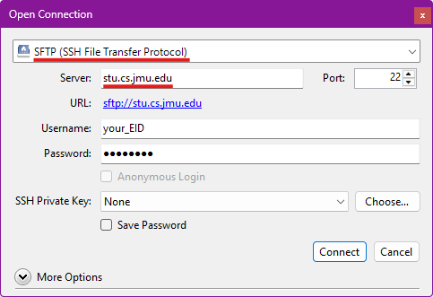
Once you have Cyberduck installed, start by clicking on “Open Connection” in the upper-left.

You should connect to stu.cs.jmu.edu using the sftp:// protocol, setting your username and password as appropriate.
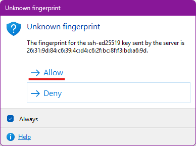
The first time you connect to stu, you will get a warning about an “Unknown fingerprint”. Go ahead and click “Allow” (you can also check the “Always” box to avoid seeing this again).
Once connected, Cyberduck should default to opening your home folder on stu. If not, you can navigate back by going to /cs/home/stu/your_eid.
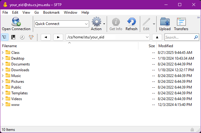
You should see a folder named “www”. This is actually a shortcut (symbolic link) that links to /cs/www/stu/your_eid. Double-click on “www” to navigate there. It should initially be empty, unless you have previously published something here.
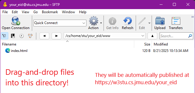
Any file that you drag-and-drop into this directory will be published on w3stu automatically. If you copy a file called foo.html into this directory, you can access that file by pointing a web browser to the URL https://w3stu.cs.jmu.edu/your_user_name/foo.html. Within FileZilla, you can also create subdirectories to organize your site’s pages.
Note: If you are comfortable with working on the command line, you might try doing this lab using something like scp or rsync. You can find plenty of tutorials for either by searching. The scp command line would look something like:
$ scp index.html <i>your_user_name</i>@stu.cs.jmu.edu:~/www/index.html
File Publishing
Your first task is to download and publish the following files based on the naming conventions shown below. Right-click on each to save a copy to the desktop on your computer.
Step 0: Edit index.html
Now that you have saved the files locally, edit them.
Open the index.html file in a text editor and change your name in the <meta> tag that indicates the “author” of the file.
Plain Text Editors
NOTE: you should open them in a plain text editor. This course’s docs explain that we can only support vscode.
Unfortunately, seemingly reasonable apps (e.g. TextEdit on macOS) are not good choices. TextEdit and many others are WYSIWYG editors. They try to write the HTML for you and only show you the content (not the code).
If you save the file after opening in one of these, it may have changed the starting point for this assignment in unpredictable ways. You’ll have to download the file and start again.
Step 1: Publish index.html
Use the aforementioned file transfer app to transfer the index.html file so that it can be accessed at the URL https://w3stu.cs.jmu.edu/your_EID/cs343/lab1/.
Note that you will need to create the cs343 directory in your www directory and lab1 in cs343.
Every time!
When you transfer the file using the file transfer app, it is sending the file in its current state to the place you indicate on the remote server. If you later edit the file on your computer you will have to transfer it again.www directory but in www/cs343/lab1. That way, if you already have an index.html page, it will not be overwritten.Test this step by going to the URL in your web browser. If you click on any of the links, they should not work (giving you a 404 error).
Step 2: Publish the other files
Transfer the data.txt file so that it is in the same directory as the index file. Click on the "text file" link from the index file and confirm that you can access it.
Transfer the linked.html file, but you'll need to create a subdirectory and rename the file in the process. Once you've transferred the file, it should be in the www/cs343/lab1/linked subdirectory and renamed as index.html.
When you are finished, you should have the following files and directory structure, and all links in the index file should work:
https://w3stu.cs.jmu.edu/your_EID/cs343/lab1/https://w3stu.cs.jmu.edu/your_EID/cs343/lab1/index.htmlhttps://w3stu.cs.jmu.edu/your_EID/cs343/lab1/data.txthttps://w3stu.cs.jmu.edu/your_EID/cs343/lab1/linked/https://w3stu.cs.jmu.edu/your_EID/cs343/lab1/linked/index.html
Validation and Minimization
Throughout the semester, your lab and project submissions need to successfully pass the W3C Nu HTML Validator. The provided index.html file does not pass. Copy and paste the link to your published version and fix the error based on the feedback there. Do the same for the lab1/index.html file. Note that there is one error there (use of <tt>) that cannot be fixed based on what we have discussed so far.
Submission
- Download this file (named
site.txt) and edit it with vscode. You should only need to replaceyour_EIDwith your JMU EID. - Submit your modified version of the
site.txtfile to the Lab 1 assignment on Gradescope.
Acknowledgements
You may have noticed that the activity includes a specific instructor’s name and a particular semester. Likely these values do not match your professor/semester. While the associated autograder and likely parts of the instructions here have been updated since those dates, citing our sources and paying homage to the efforts of those who came before us is one of the best parts of participating in the teach world. Recognizing that there have been many other to contribute since, for his efforts on the earlier versions of this activity, we’d like to send HUGE THANKS TO DR. MICHAEL KIRKPATRICK!
3 - Lab 2 - Document Structure with HTML
In this lab, you will be formatting a text document as an HTML version
of this screenshot. Note: All of the
text content is provided in the starter code below. You just need to
format markup the document as HTML.
Starting Code
😉 Create a directory for this lab
As a reminder, in whatever location on your filesystem you will collect our course’s work (e.g. the suggested dev directory), begin by:
- creating a directory specifically for this activity (name it something reasonable, e.g.
lab2) - tell vscode to specifically open this directory (not its parent, the
devdirectory or any individual files)
Use the provided lab2.txt to avoid copying and pasting large
chunks of text from the PDF. Lines beginning with # are intended as
guidelines, and should be converted into HTML comments.
<!-- as a reminder HTML comments begin with those 4 characters at the beginning of this code sample and end with the following 3 -->
Step 1: Basic HTML Documents
Your task is to add HTML elements to the provided text file to create the document structure. Note that the PDF was generated using a word processor and we are only using HTML. As such, some appearances (fonts, spacing, etc.) may not be exactly the same. You should try to make it as close as possible, however.
For this step, you need to have a correctly formatted header to create a valid HTML file. You also need to format all paragraphs and lists correctly.
You could approach this either by:
- renaming your downloaded copy of the provided
lab2.txttoindex.htmland working directly there, or - creating a new file called
index.htmland copying selections fromlab2.txtinto it as you proceed through the lab.
Step 2: HTML Document Structure
Once you have all the previous components, you need to add the remaining HTML elements, such as the title, subtitle, and horizontal lines. You also need to add the JMU logo image at the bottom. The only things that should be missing at this point are the portions controlled by JavaScript.
Step 3: JavaScript Fundamentals
Once you have added the required HTML elements, you will need to add
JavaScript code in a few places. Each of these will require a separate
<script> tag:
- Just after the (opening)
<body>tag, create the variables as described in thelab2.txtfile. - Use one variable as a Boolean to determine whether or not to show the JMU logo image at the bottom.
- Use the other variables as Strings that contain both the level 3 heading tags and the corresponding text.
Submission
In addition to the formatting of your source code itself (which you should ensure vscode has done, using the defaults), your submission must also validate cleanly with no errors or warnings.
Note that publishing your file is not necessarily to test validation. The easiest way to test validation is to install a browser extension/add-on. Search in your browser’s extension tool for “HTML Validator” (by Marc Gueury, you should already have this if you completed the Dev Setup). You can also copy and paste the HTML into the validator itself (selecting the “text input” from the “Check by” drop-down list).
You will submit your index.html file to Gradescope for
submission.
🛑 Don't publish to stu
You should not publish your code for this assignment tow3stu,
as that makes it public for all to copy from. 😅
4 - Lab 10 - Card Creator
Greeting Cards

In this (two-part) lab, you will write a tiny app to create greeting cards that you can send to your friends, family, and more! You will need the knowledge you’ve built in the past two preps (forms and localStorage).
For this lab, you will submit the assignment individually (but feel free to collaborate with others) via GitHub Classroom.
Getting Started
- Accept the assignment in GitHub Classroom using your instructor-provided link (in Canvas)
- Clone the newly-created repository on your computer
- Open the repository folder in VS Code
- Look over the provided code to get a feel for what it does and where you need to add your own
Creating the Form
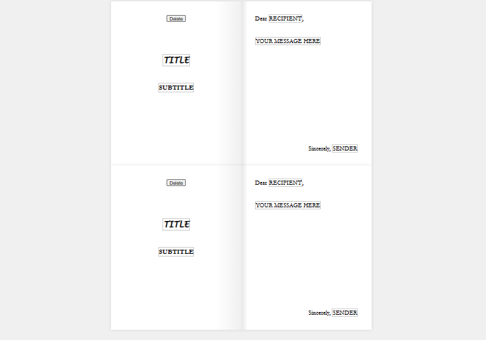
We’ve provided the code and styles for the “preview” area of the page, but you’ll need to create a form and provide the functionality for a user to specify what their card’s title, message, to, from, etc. should be. Follow the image and the instructions below:
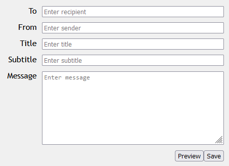
In card-creator.html:
- Create an HTML
forminside theform-area- Give the form the class
card-form
- Give the form the class
- You will need four text
inputs and atextarea, each with its ownlabel- Put each group of
labelplusinputin its owndivelement- Give this
diva class ofform-group - For example:
<div class="form-group">
  <label ... > ... </label>
  <input ... />
</div>
- Give this
- Make sure to include
placeholdertext - You’ll want to make sure each element has a
nameandid
- Put each group of
- Add two
buttons at the end of theform- Put all buttons inside a
divwith the classform-buttons - The preview button should have
type="button" - The save button should have
type="submit" - Make sure they have
ids, so you can access them easier in a script
- Put all buttons inside a
Adding the Functionality
In the scripts/createcard.js file, write some JavaScript to do the following:
- When the “preview” button is clicked, you should set the text in all the appropriate
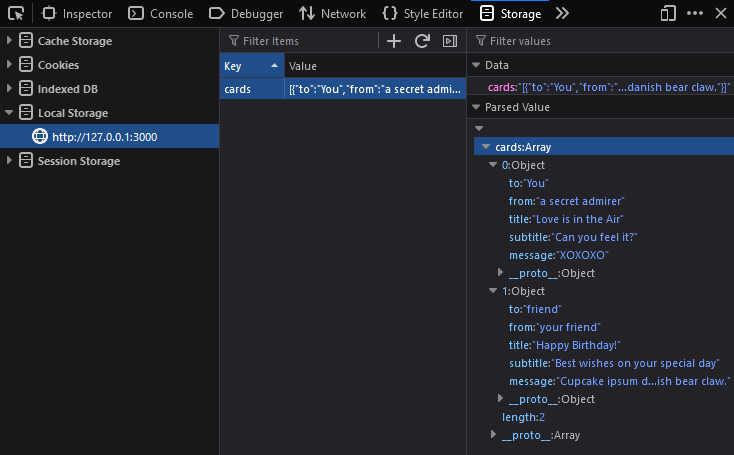
spans to the value of the corresponding control in the form. - When the “save” button is clicked, you should add the card to an array and save the array of cards to
localStorage:-
You should start by loading the existing array from
localStoragewith the keycards- If there doesn’t exist an entry with the key, create a new array and assign it to a variable
- If there does exist an entry with the key, you should parse it and assign it to a variable
-
Create a new JavaScript object (aka map/dictionary) to represent the current card
- It should have five properties:
to,from,title,subtitle, andmessage - The properties should be set to the corresponding value from the form
- It should have five properties:
-
Add the new object to the end of the array
-
Store the array in
localStorageto the entry with the keycards, overwriting any existing entry- Don’t forget:
localStorageonly lets you store strings, so you’ll need to “stringify” the array!
- Don’t forget:
-
Saving multiple cards should result in an array containing all the cards. You can use the developer console in Chrome/Edge and Firefox to check if you’re doing this correctly:
-
Hints
localStorage.setItem("cards", ...)will completely replace the existing item in localStorage (meaning you will override the previous array of cards)- Thus, you need to make sure to load the existing array of cards with
localStorage.getItem("cards"), push a new item to that array, and then save the whole array back to localStorage
- Thus, you need to make sure to load the existing array of cards with
- Don’t forget that localStorage stores values as strings
- To convert an array or object to a string:
var a_string = JSON.stringify(an_object); - To convert a string back to an array or object:
var an_object = JSON.parse(a_string);
- To convert an array or object to a string:
Submission
Commit and push your code to GitHub.
5 - Lab 11 - Card Viewer
Greeting Cards, Part 2
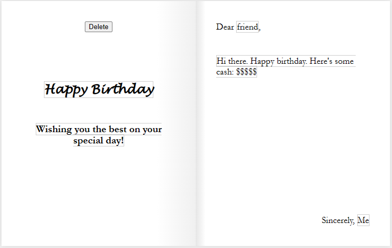
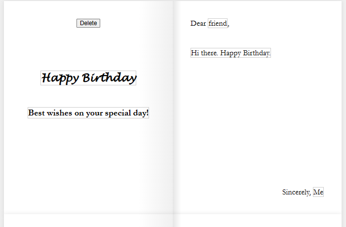
In the previous lab, you made a page that lets users create greeting cards and save them to localStorage. But we need a way to view the cards, edit them, and delete them (read, update, and delete in the CRUD operations).
Let’s create a card viewer that displays the data for each card, with a way to edit and delete each one.
Getting Started
- Start with your code from the previous lab
- The assignment is available in GitHub Classroom using your instructor-provided link (in Canvas)
- Let your instructor know if you do not have a working
card-creator.htmlorcreatecard.js
Open up the card-viewer.html and scripts/viewcards.js files. You will be working with these for the lab.
Loading and Looping
First, we will need to load the array of cards from localStorage so that we can loop over each card and display it.
-
In
viewcards.js, use localStorage to get the item with the key"cards"and convert it back to an array. Store this to a variable or constant calledcards.- Don’t forget to use
JSON.parse(...)!
- Don’t forget to use
-
Next, use a “traditional”
forloop to loop over the array (using indices – this will be important later!)- Also important: use
letinstead ofvarfor your variables - Recommended: save
cards[i]to a variable calledcardto make it easier to reference
- Also important: use
-
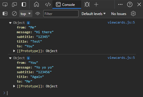
Inside the loop, use
console.log(...)to print the current card object in the iteration. -
Test your page in the browser and open the developer console
- FYI, you should always be testing your code like this to make sure there are no JavaScript errors!
-
You should see something like this:
Creating Multiple Cards
The next task you will tackle is to display a card for each item in the array. In the HTML, you will find a <main> element with the id of card-list. All the card displays should be a child of this element.
One way to do this is to create all the elements manually in JavaScript (using document.createElement(...)) to form parts of a card, and then add it to the card list. This, however, is not maintainable. We should be able to define what we want a single card to look like in HTML and CSS and then reuse that code for each card.
The <template> element makes our lives much easier. It lets us write HTML that doesn’t render in the browser, but can be cloned and inserted into our page.
-
First, take a look at this article on using templates: HTML
<template>Tag- Look at the HTML for the examples. Do you see where the templates are defined?
- We can use
document.getElementById()ordocument.querySelector()to first select the template element - We can then call the
.content.cloneNode(true)method on that template, which will return a new Node representing a copy of that template - Then, we can append that copy somewhere on our page
-
Let’s apply the same principle to our card viewer:
- In your JavaScript, select the template element and store the reference in a variable named
template.- (You can do this inside or outside the loop)
- Inside the loop, call
template.content.cloneNode(true)to create a copy of the template, and then save it to a variable namedcardView. - Finally, select the element with the
card-listclass, and call.appendChild(cardView)on it to add the newly created card to the list.
- In your JavaScript, select the template element and store the reference in a variable named
-
Test your code. You should have multiple cards displayed, one for each card in localStorage:
Displaying the Data
Now, we need to populate the newly created cardView with the data from the current card.
Thus, write this code before you call .appendChild(), but after .cloneNode():
-
First, select each of the
<span>s that are used to display the card’s text and save them to variables:- For example,
let titleText = cardView.querySelector(".title-text");- (note that we use
cardView.querySelector(...)instead ofdocument.querySelector(...)because we only want to search inside the current card view)
- (note that we use
- You should repeat this a total of five times, one for each span.
- For example,
-
Set each of those
<span>’stextContentto the appropriate values from the current card object:- Remember that each card is an object, so you can access the attributes directly: e.g.,
card.title - The five attributes are: to, from, title, subtitle, message
- Remember that each card is an object, so you can access the attributes directly: e.g.,
-
Test your code. Each card should display its corresponding text:
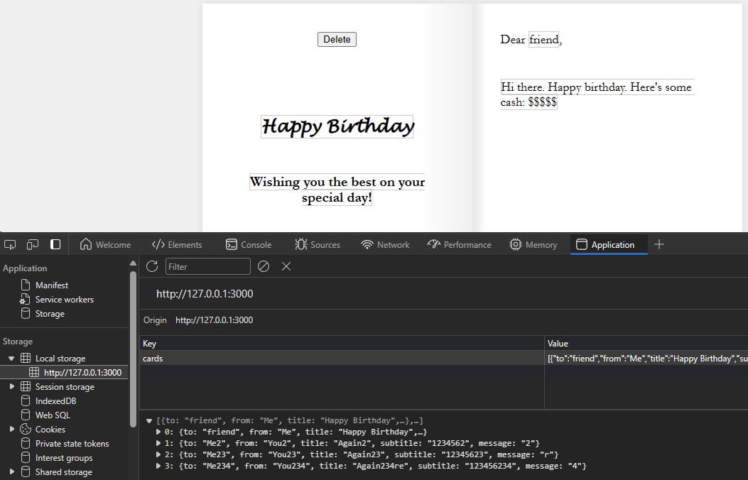
Deleting Cards
Let’s make the delete button work. To do so, we’ll need to do a few things.
- Continue with your code inside the loop. Make sure that the following lines are still before you call
.appendChild()! - We need to make the delete button for the current card do something.
- First, select the delete button on the
cardView(again, usecardView.querySelector(...)) - Then, add an event listener of type
"click" - For the callback function, write it inside the for loop. You can use either a function declaration or a function expression.
- First, select the delete button on the
- When the button is clicked, we want to delete this card. The problem is, how does each delete button know which card its referring to?
- In the callback function, write
console.log(i). - Test your page and open the developer console. Click on the delete buttons. Notice how each button somehow prints out the corresponding index!
- How does this work? When we create a function, JavaScript will “save” the state of our variables in something called a closure.
- If this isn’t working, you may have declared your variables with
varinstead oflet. This is one of the advantages oflet. It scopes the variable to the block instead of the function, which lets us keep its current state. - If closures scare you, there is an alternative method below
- In the callback function, write
- Now, in the button’s callback function:
- Make the button delete the item in the array at the current index
- Use the
.splice(...)method to remove an item at a given index
- Use the
- Afterwards, save the array of cards back to localStorage
- Don’t forget to stringify it!
- After saving, reload the page by calling
location.reload()- We do this because, after deleting an item, the indices in the array are no longer valid, so let’s refresh the page and display all the cards again
- This is easier than trying to keep everything in sync
- Make the button delete the item in the array at the current index
- Test your code. You should be able to delete a card and, once the page reloads, it should no longer be displayed.
(If you have time) Making the Cards Editable
Last but not least, let’s make the cards editable. You may have noticed that there’s a contenteditable attribute on each of the <span>s! This makes the element into something that works both as text and an input.
Elements with contenteditable have an event called "input", which is fired whenever a user changes the value of the element.
-
Inside the loop, but before calling
appendChild, let’s declare/create a new function. Yes, right here.- Name the function
updateCard() - Inside, you should set each of the current card object’s attributes (to, from, title, subtitle, message) to the content from the corresponding
<span>s- For instance,
card.title = titleText.textContent;orcards[i].title = ...
- For instance,
- Afterwards, save the entire array to localStorage again.
- Don’t forget to stringify it!
- Name the function
-
After the function definition, but still before
appendChild, add an event listener for the"input"event to all five<span>s. Use yourupdateCardfunction as the callback:- E.g.,
titleText.addEventListener("input", updateCard);
- E.g.,
-
Test your code by clicking in one of the fields and editing it. You should see the value change in localStorage:
- If you are having issues, double-check:
- Make sure you are using either
letorconstfor your variables/constants, notvar - Make sure you are passing
updateCardas an argument, and not accidentally calling it withupdateCard()
- Make sure you are using either
- If you are having issues, double-check:
Alternative to Using Closures
Instead of using closures, you can also “store” the index of each card in the HTML elements themselves! We can create a custom HTML attribute, called a data attribute.
Here’s how that would work instead of closures:
- On each card view and/or each of the
<span>s:- Add a new data attribute called
indexusing JavaScript (aka"data-index"in HTML)- Reference the MDN article for examples
- Set the value to the current index of the card
- Add a new data attribute called
- In your event handlers/callback functions, retrieve the
indexattribute.- Attributes are stored as strings, so you may need to convert it back to an int
- Use this value to specify which card to delete/update
Submission
Commit and push your code to GitHub.
6 - Lab 14 - Play Fetch
Learning Objectives
By the end of this lab, you should be able to:
- Understand the different request methods and how they differ
- Use fetch() to interact with third-party APIs
- Modify an HTML page based on the result of an API call
Introduction
In this lab, you will use the knowledge you’ve learned about HTTP requests, asynchronous Javascript (including Promise), and fetch() to interact with a third-party API and use its results to modify an HTML page.
You’ll start by practicing your requests and learning about the different request methods and the different ways of formatting data for a request.
Then, you’ll retrieve data from an API and use it to populate a page and modify the DOM.
In the last part, you will write some starter code that interacts with the specific API you chose for the class project.
Getting Started
Start by going to the GitHub Classroom link provided by your instructor and accept the assignment. For this lab, you may work in your project groups.
Clone the created repository to your computer. You will need to use Live Preview or Live Server for this lab; opening the file directly in your browser may prevent some requests from working.
Open the repository folder in VS Code.
Part 1: Requests Practice – Echo (echo) Server
For this first part, we will be interacting with an “echo server” that simply echoes back the request that you give it. We’ll use Zuplo’s Echo API.
Start with the part1.html and js/part1.js files. You will see a couple of input fields and three buttons, plus an area for the output. Each of the buttons needs to make a specific request to the echo API, and then display the resulting JSON in the output. You shouldn’t need to modify the HTML for this lab, just reference it. Edit the JavaScript like so:
-
Write the event handler for
get-btn(this should be stubbed out for you inpart1.js):-
This function should send a
GETrequest to thehttps://echo.zuplo.io/apiendpoint. -
The request should include the name and the age as parameters in the URL’s query string
-
There are two ways of accomplishing this:
- Manually add the keys and values to the URL. Example:
let resp = await fetch("https://www.mywebsite.com/search?q=" + query + "&page=" + pageNum);- In this example,
qandpageare the keys, andqueryandpageNumare the variables containing the values to encode. - Also note how we must
awaitthefetch()call, since it returns aPromise. Alternatively, you can use.then(...)to handle thePromise.
- In this example,
- Use URLSearchParams and give the constructor an object containing the keys and values you want to encode. Example:
(Note: the URLSearchParams constructor can also parse a query string, and then you can easily access its keys/values)
let params = new URLSearchParams( {q: query, page: pageNum} );
let resp = await fetch("https://www.mywebsite.com/search?" + params.toString());
- Manually add the keys and values to the URL. Example:
-
After you get the response from the server, parse the body as JSON
-
Set the
textContentof the<pre>element (with the id ofoutput) to a nicely-formatted version of that JSON, usingJSON.stringify:JSON.stringify(...)can take in three parameters: the object you want to stringify, a “replacer” (which can be null), and the number of spaces to indent the JSON. This will produce a formatted version of the data:let data = { city: "Seattle", population: 757992, }; // JSON.stringify(object_to_format, null, num_spaces_for_indent) let formatted = JSON.stringify(data, null, 2);
-
Test the “GET” button (open the developer console to check for errors). You should see something like this:

Notice how the
"query"attribute contains the parameters from the query string we gave.
-
-
Next, write the event handler for
post-json-btn:-
This function should do the same thing, except, instead of a
GETrequest, it should send aPOSTrequest. -
The body of the request should be JSON data that contains the
nameand theage:- The
fetch()function can accept a second argument, which is an object that specifies the request options:let options = { method: "POST", headers: { "Content-Type": "application/json", // or "application/x-www-form-urlencoded", "text/plain", etc. }, body: JSON.stringify( {q: query, page: pageNum} ), }; let resp = await fetch("https://www.mywebsite.com/search", options);
- The
-
Again, after you get the response, parse the body as JSON and display it in
output. This should look like: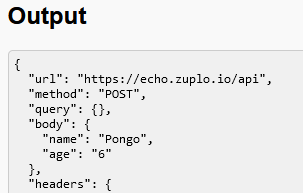
Note how now the request’s data was found in
"body"instead of"query".
-
-
Finally, write the event handler for
post-form-btn:-
This function does the same as the last, but, instead of the data being formatted as JSON, the data should be formatted as “URL-encoded” form data. This is how HTML forms usually POST their data to a server.
-
The body of the request basically contains data in the same format as a query string:
let options = { method: "POST", headers: { "Content-Type": "application/x-www-form-urlencoded", }, body: new URLSearchParams( {q: query, page: pageNum} ), }; let resp = await fetch("https://www.mywebsite.com/search", options); -
You should also parse the response’s body as JSON and display it in
output. This should look like:
Now, look at how the request’s data are formatted in the
"body".
-
With Part 1, you should feel comfortable using fetch() to make requests and include data in both the query string and the request body. These are fundamental tools to add to your arsenal for dealing with any API you may encounter!
Part 2: List Those Users!
Now that we’ve practiced making API requests with a simple echo server, let’s go a little further and interact with an API that actually gives real (fake) data! We will use reqres.in, which provides mock data via a simple set of API endpoints.
API Key
First, go to https://reqres.in/signup to get the free API key needed. This is common for many APIs, even free ones.
You can see that, in order to use their API, you need to include an x-api-key header with your API key in every request. This can be done by passing in an options object as the second parameter to fetch(), and then including a headers attribute in that object. For example:
fetch('https://reqres.in/api/users', {
  headers: {
    'x-api-key': 'reqres-free-v1'
  }
})
See the documentation for more details.
List Users
Open the part2.html and js/part2.js files. The HTML contains an example of how a user should be displayed and an empty <div> with the id of user-list.
- In
js/part2.js, inside theDOMContentLoadedevent handler, write code to request the first page of users fromreqres.in:- First, take a look at the API endpoints for
reqres.in, specifically the “List Users” endpoint. - The base URL is
"https://reqres.in", and the endpoint is"/api/users". This means that the full URL you should send the request to is"https://reqres.in/api/users". - What request method does it use? (
GET?POST?PUT?) - How do you specify which page to retrieve? (Query string? JSON body? Form body?)
- First, take a look at the API endpoints for
- Once you get the response from the API, you should parse the body as a JSON object.
- We don’t always do this; it depends on what the API endpoint returns! (aka we need to read the documentation)
- For
reqres.in, all the endpoints return stringified JSON data in the response body.
- Next, you’ll want to loop over the returned list of users and create new elements in the HTML for each user.
- Take a look at the format of the returned data first on the
reqres.inwebsite! - Each new user added to the HTML should follow this format:
<div class="card"> <h2>Firstname Lastname</h2> <img src="https://reqres.in/img/faces/some_image.jpg" alt="Firstname Lastname"> </div> - You can create the elements manually in JavaScript, you can clone the existing example, or you can create a
<template>to use.- You may minimally modify the HTML to help you, but the format of each user must match the example above.
- Make sure each new user card is added to the
<div>with the id ofuser-list. Also don’t forget to add the"card"class to the<div>!
- Take a look at the format of the returned data first on the
The result should look like this:

Part 3: Your Project APIs
For this last part, you will interact with the API you chose for your semester-long project. For now, you will simply make a request and display the response.
Open the part3.html and js/part3.js files. You will need to modify both the HTML and JS for this part.
Important Setup
⚠️ Before you begin, there are two things you need to be aware of: ⚠️
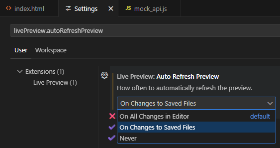
-
Disable Auto-Refresh for Live Preview: If you use the “Live Preview” extension, by default, it will refresh the page every single character you type! If your page automatically fetches data when it loads, uh-oh… that’s a lot of requests!
- In VS Code, open the settings (File -> Preferences -> Settings), search for “Auto Refresh Preview”, and set it to “On Changes to Saved Files” or “Never”.
-
Mocking API Requests: Some APIs have rate limits or restrictions on how many requests you can make in a certain time period. To avoid hitting those limits while you’re developing your code, we’ve included a simple way to “mock” the API requests. This is optional, but recommended.
- Download this file: mock_api.js and then put it in your
js/folder. - Include it in your HTML file before any script that makes API requests (recommended to put it in the
<head>):<head> ... <script src="js/mock_api.js"></script> </head> - For all requests, instead of calling
fetch(...), callmockFetch(...)instead.- It will use a cached version of the response if available, which is stored in
localStorage. - If no cached version is available, it will make the actual request and then store the response in
localStoragefor next time.
- It will use a cached version of the response if available, which is stored in
- To disable mocking and always make the actual request, set the
MOCKvariable inmock_api.jstofalse. - Note that this only works for JSON and text responses, and only for
GETrequests.- For others, you should still use
fetch(...)as normal.
- For others, you should still use
- Download this file: mock_api.js and then put it in your
Information Gathering
- In
part3.html, for API #1, replace[TODO]with the name of one of your APIs. - Next, go to the documentation for your specified API. Find a specific endpoint you want to use. Take note of the following:
- What is the base URL for the API?
- (This is usually found in a “Getting Started” or “API Concepts” documentation)
- Does your API require authentication? How do you provide it?
- (This is also usually found in “Getting Started” pages)
- What is the path to the specific endpoint?
- (Found on your specific endpoint’s documentation)
- What method does the endpoint use?
- (
GET,POST,PUT,PATCH,DELETE)
- (
- How is the data specified?
- (In the query string? In the body as JSON/form-urlencoded?)
- What format is the data returned in?
- (JSON? Text? No data?)
- What is the base URL for the API?
- In the HTML, replace the
[TODO]for the URL with the full URL of the endpoint you will be using. - Also replace the method (
[GET/POST/PUT/...]) with just the specific one you will be using.
Making the Request
- In the
js/part3.jsfile, in the event handler for theapi-1-btn, write code to make the request and output the returned data.- If you’re using the mocking feature, use
mockFetch(...)instead offetch(...). - If your API’s response does not contain any data in the body, output the status code instead.
- I recommend using the MDN docs on
fetch()as a reference. - Also
console.log(...)the response object (fromfetch()) so you can look at it in the developer console! - Make the output nicely formatted if it’s JSON, just like in Part 1.
- If you’re using the mocking feature, use
- Test the button. Does it display anything? Make sure to open the developer console to check for errors!
- Usually the HTTP status code of the response can help diagnose what’s wrong.
- Sometimes, its as simple as missing a parameter, or forgetting to include the “Content-Type”!
- If you are getting an error saying something about “CORS” or “origin”:
- Does your API support CORS?
- (This can be found in the documentation or on the public api list if that’s where you found your API)
- What is CORS?
- Cross-Origin Resource Sharing (CORS) is a way for a server to say, “Hey, I’m allowing other webpages to access me! Here’s a list of the ones I approve of.”
- Without CORS enabled, web browsers will NOT allow a page to access that specific server/resource! This is for security reasons; otherwise, malicious websites could send requests to, say, your banking site, using your login credentials!
- However, server-side applications can still access that server; CORS is only for restricting client-side access.
- This means that we are unable to access it from anything we do in CS 343. We would need to access it via a backend.
- But wait! There’s a workaround:
- Simply tell a server to make the request for you!
- There’s a free “CORS Proxy” at CORS Anywhere you can use. There is also allOrigins.win as an alternative.
- For instance, use the URL
https://cors-anywhere.com/https://req.res.in/api/usersinstead.
- For instance, use the URL
- ⚠️ The CORS proxy will act as a intermediary between you and the API server. This does open up some concerns about latency and security, so only use it for non-sensitive data and only for this class.
- Does your API support CORS?
- Did your API return something about “unauthorized”?
- You may need to authenticate your app! Look in the documentation to see how you need to retrieve an “API key” or “access token” of some kind.
- This is usually then given to the API in the header of your request, or even in the query string.
- There are other methods of authorization, which may be more complicated to use.
- Does your API require OAuth? Uh-oh…
- OAuth is a complicated authorization method that usually requires a backend server to handle the process.
- If your API uses OAuth, look to see if there’s an alternative method of authorization for your app.
- If it has something called PKCE, you may be able to use that in a client-side app.
- You may need to authenticate your app! Look in the documentation to see how you need to retrieve an “API key” or “access token” of some kind.
- Usually the HTTP status code of the response can help diagnose what’s wrong.
- This should give you a head start on the last part of the project.
- For your actual project, you will need to do something with the response, not just output it!
Submission
Commit and push your code back to GitHub.
7 - Lab 15 - Persistence: User Experience
localStorage and location Web APIs to create a more featureful user experience.Learning Objectives
By the end of this lab, you should be able to:
- create (receive/parse) a “sharable link” such that another user of your app would get to a particular state of the app
- export from– and import to
localStorage
Prerequisites
- beginning localStorage (e.g. as exercised in Labs 10 and 11)
- Familiarity with the browser’s
Locationinterface (e.g. as outlined in prep 10)
Instructions
- Begin with the starting code in the Persistodon repo
- Complete the Persistodon app as specified in the page’s aside.
8 - Lab 16 - Persistence: Import/Export
localStorage using the FileReader to support export/import of app state.Learning Objectives
By the end of this lab, you should be able to:
- export from– and import to–
localStorage
Prerequisites
- beginning localStorage (e.g. as exercised in Labs 10 and 11)
- Familiarity with the browser’s
FileReader API
Instructions
- Begin with the starting code provided by your instructor (e.g. from an assignment in your learning management system) or else in the Transportodon repo
- Complete the Transportodon app as specified in the page’s aside.
9 - Lab - Bootstrap
Overview
As we begin to look at how to specify the presentation of our webpages using CSS, this sneak peak is intended to help give you a sense of how much can be accomplished with CSS. (We will also write “vanilla” CSS that begins with no third-party code so that you know how these things are accomplished, and importantly how to modify them to suit your specific needs.) In this lab we introduce Bootstrap, but there are many design frameworks out there that provided excellent CSS starting points. For novices especially, design frameworks like Bootstrap are a great way to begin projects you intend to publish because typically the frameworks:
- are well-documented
- are well-tested
- in multiple browsers
- on multiple devices
- with many viewport sizes
- have solved issues novices aren’t even aware of yet
- have designed for accessibility
- have designed for responsiveness
- have designed for usability
- have designed for performance
- demonstrate best practices for CSS that works well with semantically-structured HTML (itself a best practice)
Specs
(Following the steps in later sections) Make a web page that has:
- a responsive navigation bar ("nav bar") at the top,
- one that has a “Responsive behavior” called a “Toggler” and
With a brand name shown on the left and toggler on the right
- one that has a “Responsive behavior” called a “Toggler” and
- a responsive content area after the nav such that:
- when the viewport is at least
768pxwide,- the left 2/3 of the content area’s will be the
maincontent area - the remaining right 1/3 of the content area will be an area for
asidecontent
- the left 2/3 of the content area’s will be the
- when the viewport is less than
768pxwide,- the
maincontent will occupy the full width of its container - the
asidecontent will come after themainand will also occupy the full width of its container
- the
- when the viewport is at least
Starting Resources
Code
Bootstrap’s documentation has the perfect starting code for you ready to roll. We recommend you use the (first) code sample from #2 in the Quick start section (for now, you can ignore the other code samples on that page including the second code block in #2).
❤️ Favicon
By now, you’ve seen that most of what goes in an html document’s head is metadata not immediately visible to the visitor, and that the content that will be rendered into the browser’s viewport is in the body. The icon that will appear by default in alongside the site’s title in browsers’ tabs and which will be used in browsers’ histories and bookmarks is often called a favicon.
This wesbos character has put a ton of useful resources on the web. While I appreciate a fun tone as much as the next prof, I think flicking off visitors on entering your site isn’t the way 🫣 I’d’ve done it. Nonetheless, FavFarm is pretty useful. Consider just referencing this example for now:
<link rel="icon" href="https://fav.farm/🕸️">
Placeholders
Placeholder text is often useful when you’re focussed only on the semantic structure and/or presentation of your page, but not yet its content. A common choice is lorem ipsum text (for the curious: there’s always more to learn), which you can grab a small example in vscode by simply typing lorem and accepting the emmet completion (via hitting tab or enter).
There’s also a delightful variety of these generators, e.g.:
- for text
- 🥓 Bacon Ipsum
- 🧁 Cupcake Ipsum
- 🚀 Space Ipsum
- 🧀 Cheese Ipsum
- 🏴☠️ Pirate Ipsum
- ➕ and 🤪 more
- for images
- 🏞️ Lorem Picsum
Step 1: Begin with the provided resources
- Start this activity as we generally recommend you start all of them
- create a file named
index.htmland paste the code sample from the bootstrap docs (linked above) into your otherwise emptyindex.htmlfile. - paste the provided favicon link into your
head(see above). - delete the Hello, World heading.
- make
doctypeall caps.
⏸️ 🩺 Step 1 Check-up
At this point, your page should:
- have no visible content.
- have a spiderweb favicon, shown in the browser tab.
- have a title of
Bootstrap demo, shown in the browser tab.
Step 2: Add some filler
So that you can see how the content of the page is affected by the subsequent steps,
- create a
mainelement as the first child of thebodyelement - create an
h1with the text contentBootstrap demoas the first child of themainelement - paste 3+ paragraphs of your favorite lorem ipsum text (each paragraph should be wrapped in a
pelement) into themainof your document (immediately following theh1). - create an
asideelement as the second child of thebodyelement - paste 3 more paragraphs of your favorite lorem ipsum text (each paragraph should be wrapped in a
pelement) into theasideof your document.
⏸️ 🩺 Step 2 Check-up
At this point, your page should:
- have the browser tab items from check #1 above.
- have a top-level heading that says
Bootstrap demo. - have several paragraphs that follow the heading.
- these paragraphs should be a little too tight on the top, right, and left sides of the viewport.
- have lovely, non-browser-default font choices (face, size, and weight).
Step 3: Add a nav bar
- Copy the 2nd example in the Bootstrap Components:::Navbar::Responsive:Toggler, the one described as
With a brand name shown on the left and toggler on the right. - Paste the copied code the first
childof thebodyin your document (i.e. it should immediately precede themainelement you created in the previous step).
⏸️ 🩺 Step 3 Check-up
At this point, your page should:
- look pretty similar to how it looked in check-up #2 above
- have a navbar before the h1 and other content.
- when the viewport is at least
992pxwide, the navbar should show all its content - else: the navbar should show only its “brand”) text that says
Navbaron the far left and an icon for the “toggler” (much more often called a 🍔 “hamburger”) on the far right.- when the navbar’s in this “collapsed” state, clicking the hamburger should expand the navbar to show all its content, but now vertically stacked, smoothly animated pushing the rest of the page content further down the page. Clicking the hamburger again should “collapse” the navbar back to its “collapsed” state.
- when the viewport is at least
Note: it’s not only “clicking” the toggler that will expand/collapse the navbar. Often a more inclusive term for “using” the toggler or other graphical user interface element is “actioning”, i.e. “when the navbar’s in this ‘collapsed’ state, actioning the hamburger should expand the navbar…”. The difference is that technically click is a precise event that happens when a mouse button is pressed and released, but the toggler can be actioned by other means, e.g. by pressing the enter or space key when the toggler is focused, or by tapping the toggler when using a touchscreen device.
Step 4: Add a content area
- After the close tag of your
navelement, let’s add a container for the rest of our page’s content. Paste the following code after the</nav>:-
<div class="container">
</div>
-
- Move both the
mainandasideelements you created in the previous step into thedivyou just created. Sometimes doing something like this might be more simply specified as “wrap themainandasideelements in adivwith the classcontainer”.
⏸️ 🩺 Step 4 Check-up
At this point, your page should:
- look similar to the step#3 check-up description above.
- have a more reasonable amount of space between the content and the left and right edges of the viewport (when your viewport is at least
576pxwide).
Step 5: Implement responsive behavior
Bootstrap implements several pre-defined responsive “breakpoints”.
In this use of the term, a breakpoint is not a place to pause code when using a debugger, like most of our prior uses of the term.
Rather, it means a value in a range the is used as the threshold for a change in presentation/behavior.
To accomplish the specs, we need to figure out where a viewport width 768px falls in the range of Bootstrap’s breakpoints. According to the docs, viewports with a width of at least 768px are considered “medium” which is represented in bootstrap’s classes with the abbreviated md.
- Wrap the
mainandasideelements in adivwith the classrow. (So you’re adding only onedivelement, but it will have two children:mainandaside.)- so this new
divshould be the only child of thedivwith the classcontaineryou created in the previous step.
- so this new
- Add this class to your main element:
col-md-8, which means that at viewport widths of at least768px, the main element should be presented as a “column” (within the row you just added) that takes up 8/12ths of the width of its container. - Add this class to your aside element:
col-md-4, which means that at viewport widths of at least768px, the aside element should take up 4/12ths of the width of its container.
⏸️ 🧐 Check it
At this point, you should have a page that looks pretty different depending on the viewport width:
- width of
768pxor wider:- navbar at the top that looks like the one in the boostrap docs with a wide viewport:
-

at "medium" or wider viewports
-
- content area below the navbar that has 2 columns:
- the left column is 2/3 of the width of the content area
- the right column is 1/3 of the width of the content area
- navbar at the top that looks like the one in the boostrap docs with a wide viewport:
- width narrower than
768px:- navbar at the top that looks like the one in the boostrap docs with a narrow viewport:
-

at narrower viewports than "medium"
-
- content area below the navbar that has only 1 column showing:
- (first) the
maincontent, followed by - the
asidecontent
- (first) the
- navbar at the top that looks like the one in the boostrap docs with a narrow viewport:
You may find it convenient to use the devtools’ Responsive Design Mode to check how your pages behaves on wider vs. narrower viewports.
🛑WAIT A MINUTE!
That check it was wrong! the navbar doesn’t curently expand at 768px! It only expands at some larger value (seems like it’s at 992px or above). HOW CAN YOU FIX IT?Step 6: Accordion
In Graphical User Interfaces on your computer, phone, watch, fridge? contact lens?!, you have become accustomed to some common ways for information to be presented and common dynamic behaviors of those presentations, let’s call a representation of information and its dynamic behavior a “widget”.
Bootstrap implements many commonly used “widgets” as components. One of them is an accordion. Let’s try out the accordion.
- copy the first code example from the accordion docs and replace all the paragraphs in your
asidewith the code you copied.
Going Further
Navbar
Color the navbar
- read the docs and try to apply the
primarycolor schemeto the navbar- if you succeed, you may agree that the navbar looks nice, but now the search box looks weird. I think it looks better to make one more modification in this case: find the
formin the navbar and add this attribute and value to it:data-bs-theme="light" - oh dang, now the search button kinda sucks too huh? I think it looks better to make one more modification in this case: find the search
buttonin the navbar. Notice it has the classbtn-outline-success? drop the-outlinepart of that class name. Dang, this is still pretty low contrast… 🤔 know what, make itbtn-light. That seems alright.
- if you succeed, you may agree that the navbar looks nice, but now the search box looks weird. I think it looks better to make one more modification in this case: find the
Give the navbar margins to match content
- in your
navelement, you’ll see one of the first children (which contains all the other descendants ofnav) is an element with classcontainer-fluid. Remove the-fluidpart of that class name. Read more on Bootstrap Containers if you like.
Navbar breakpoint
Currently the responsive behavior of the main content area is based on the md breakpoint, which is at 768px, but the navbar’s responsive behavior is based on the lg breakpoint, which is at 992px. This means that the navbar will be in its “collapsed” state when the viewport is between 768px and 992px wide, but the main content area will be in its “2 column” state. This is a little weird. How can you fix it?
Only show aside when there’s enough real estate
- read the docs (e.g. these about hiding elements) and try to make it that the
asideis either hidden (on viewports narrower than768px) or shown on wider viewports as previously specified (a column that takes 4/12 of the available width).
10 - Lab - Responsive Branching in Week 07
Objectives
- moar CSS Grid
- dark mode
- git branching
In this week’s prep, you completed a responsive grid design that uses two “breakpoints” to distinguish three layouts for a page. In this lab, you will continue with the same code base (but you should start from our version…), but you will work in pairs 🍐🍐 (see below for specific instructions on collaborating). One partner will add a new tiny mode to the grid, while in parallel the other partner will add dark mode 🦇.
Pairing
- accept the github classroom assignment linked from your canvas course
- in doing so, tell github classroom that you’re in a group with your neighbor
- If your instructor doesn’t do things that way ⬆️, (because if they do, you’ll need to start with the github repo provided there to be linked up correctly to their roster and everything) you may want to start by visiting this repo and choosing
Use this template.
- both you and your neighbor: clone the repository to your local machines
- Make a branch that you name as your EID, so like mine will be named
stewarmc- you are both doing this on our own computers, so you will each have the
mainbranch you cloned and then 1 more branch, named for your own eid
- you are both doing this on our own computers, so you will each have the
- (each of you) Push your new branch to the github repo in a remote branch with a matching name
- Assign one partner in the pair to the Tiny Grid task below, the other to the Dark Mode task below
- Each of you complete your task in your own branch and commit the changes to your branch and push your branch to github.
- When you’re done, work together to merge the branches into main on one of your computers, then push the code to main in the remote repository.
- Submit however your instructor requests, one way that might be common is to get the commit URL from the preceding step (it might look like
https://github.com/SOMETHING/SOMETHING-ELSE/commit/LONG_HEXADECIMAL_HASH) and submit it to the assignment in your learning management system.
Tiny Grid
- Replace the fake name in the
README.md’s Acknowledgements with your own name. - add the README.md changes to the staging area, commit the changes, and push the changes to the remote repository.
- edit the tiny.css such that when the viewport width is less than 375px, the layout changes such that only the “main article area” is displayed.
- add the tiny.css changes to the staging area, commit the changes, and push the changes to the remote repository.
Dark Mode
- Create a new file called
dark.css - edit your
index.htmlto include a link todark.cssin theheadof the document just before it links todebug.css - edit
dark.csssuch that if the user has a “dark” preference, the page will be styled with a dark theme.- What the dark color scheme should be is your choice!
- If you’re not feeling creative set the background of the whole page to black and the text color of the content of the whole page to white.
- Else, do something nice (maybe with a slightly lower contrast than the above suggestion, see the JMU CS Colors on the wiki or the Design and Style section of our Resources page for more.)
- What the dark color scheme should be is your choice!
- add a javascript file called script.js and a script tag to the bottom of the body of the html file that loads
script.js. - in
script.js, add an event listener such that when the user clicks any of the 3 nav items, the page will render with the selected color scheme.- most often, dynamic styling is best implemented via (a) defining style rules for corresponding classes in css and (b) adding/removing classes to the necessary elements dynamically
Acknowledgements
Developers:
- Nay Bored
With huge thanks to the CS 343 cheat code Mozilla Developer Network.