Lab 6 - Grids
Categories:
6 minute read
In this week’s prep, you completed a responsive grid design that uses two “breakpoints” to create multiple layouts for a page. In this lab, you will continue with this general code structure while adding more layout structure to the page. You will also add support for alternate color schemes, including dark mode.
Starting Code
Start by extracting provided source code and opening the files in your preferred text editor:
For this lab, you will need to modify all CSS and JavaScript files and submit your work to Gradescope. (Do not submit the index.html file.)
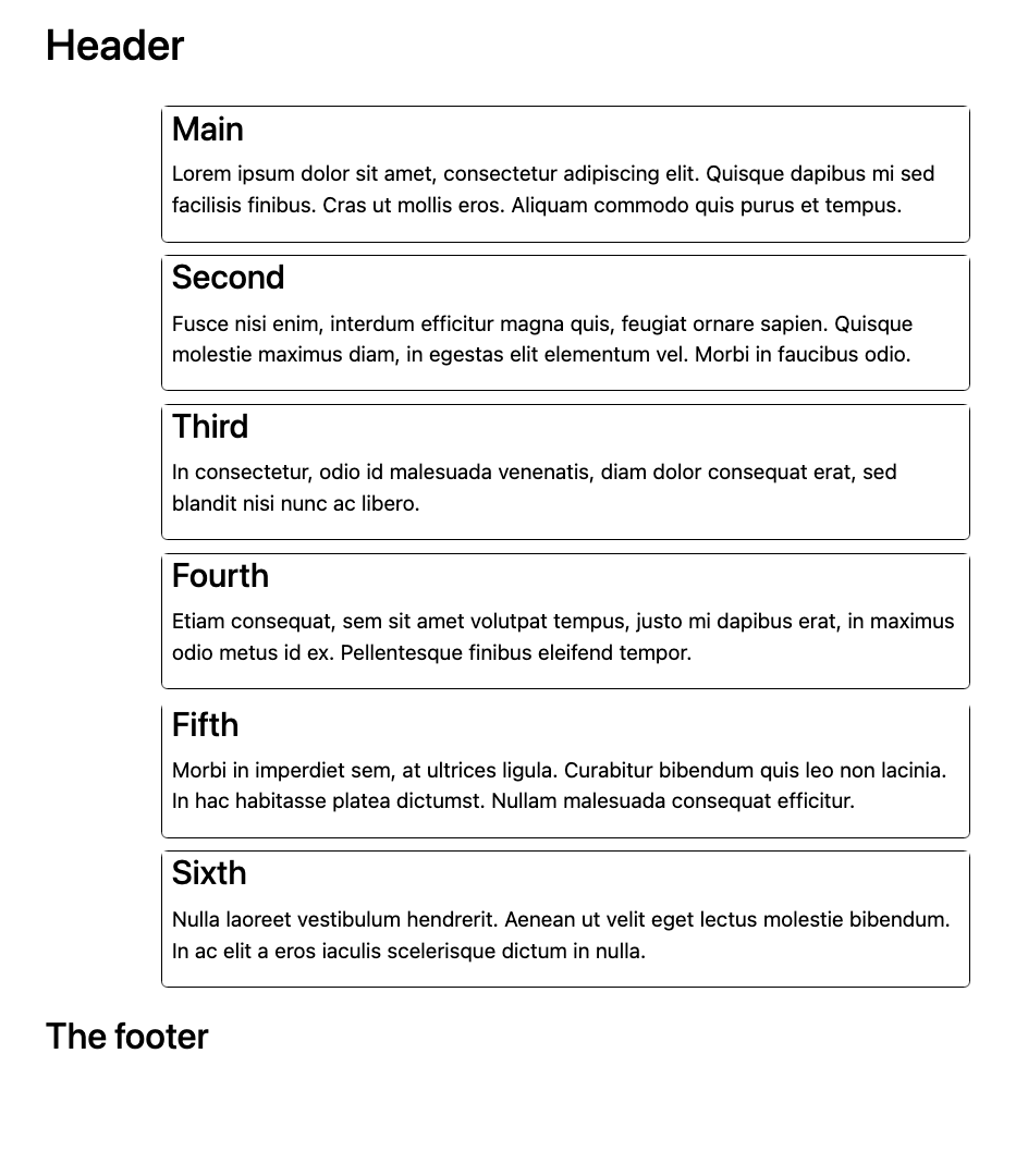
Tiny and Print Grids
Throughout this lab, we will refer to multiple breakpoint sizes by the following names:
- Large screens: width of 1000px or more
- Medium screens: width of 700px to 999px
- Small screens: width of 500px to 699px
- Tiny screens: width of 499px or less
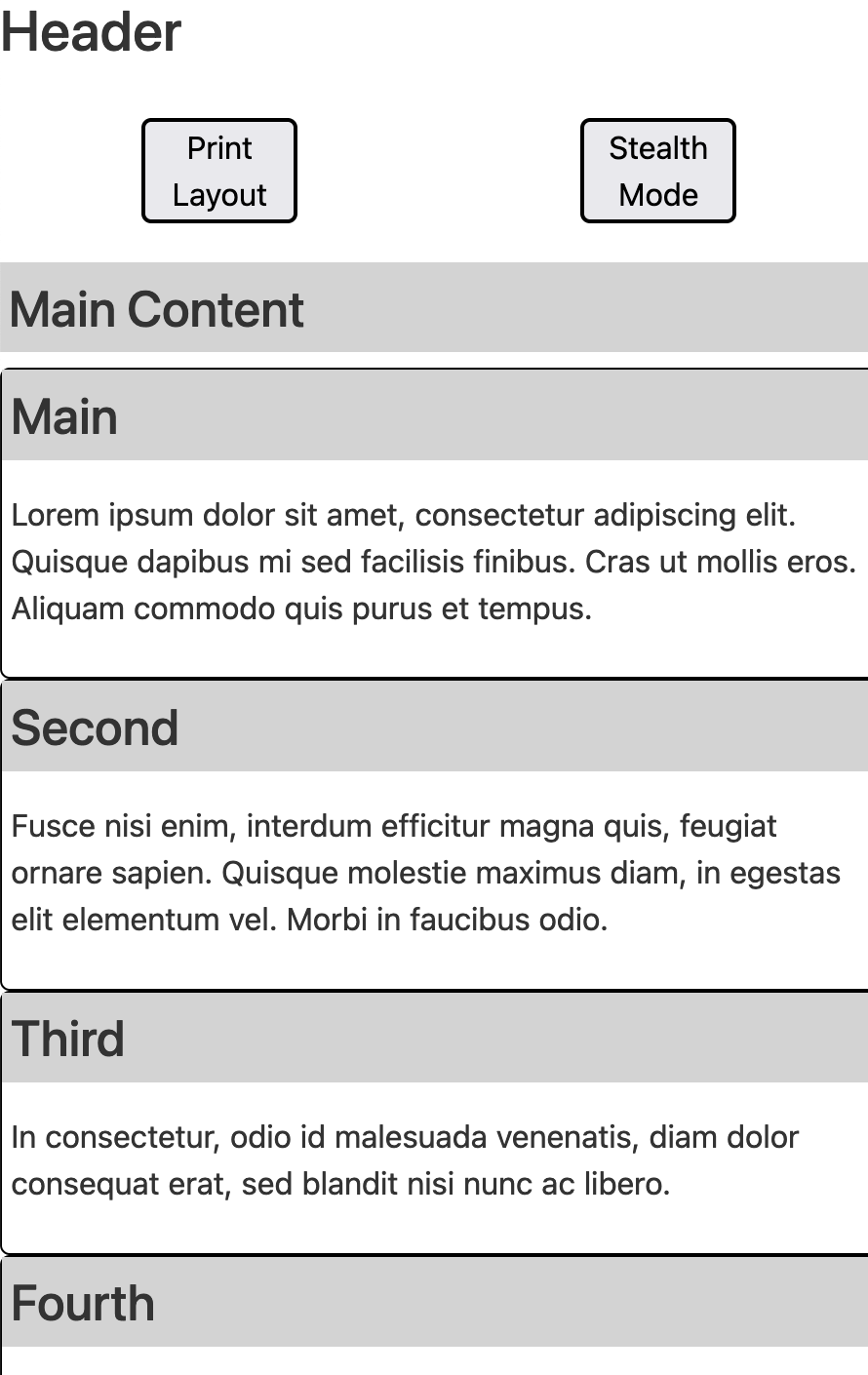
The provided source code provides an overall structure for small and medium (or larger)
screens based on the prep. But it’s a jumbled mess on tiny screens. Your first task is
to add support for tiny screens. Edit the layout.css to add this support:
- Add a new media query for tiny screen sizes
- Show the
header,nav,main, andfooterin a column - Do not show either of the
asideelements
- Show the
- Make the
navlist elements into a flex-box to control their layout- On tiny and small screens, the list should be in a row with space around the items
- On medium and larger screens, it should be a column centered horizontally, along with some spacing below each item
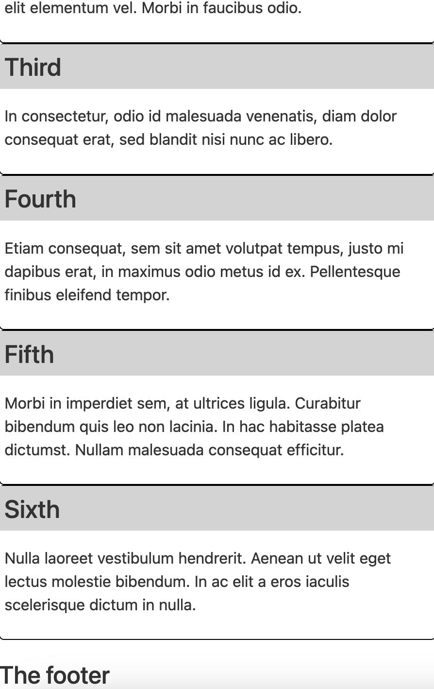
- Add another media query based on
printformatting- Show only the
header,main, andfooterin a column - Both
headerandfootershould span the full width - Make
mainoccupy one column that gets 90% of the width on the right - Do not show the
navor eitheraside
- Show only the
When you are finished, the tiny layout should have match these top and bottom images. For the print formatting, you’ll need to complete the next section to confirm it is laid out correctly.
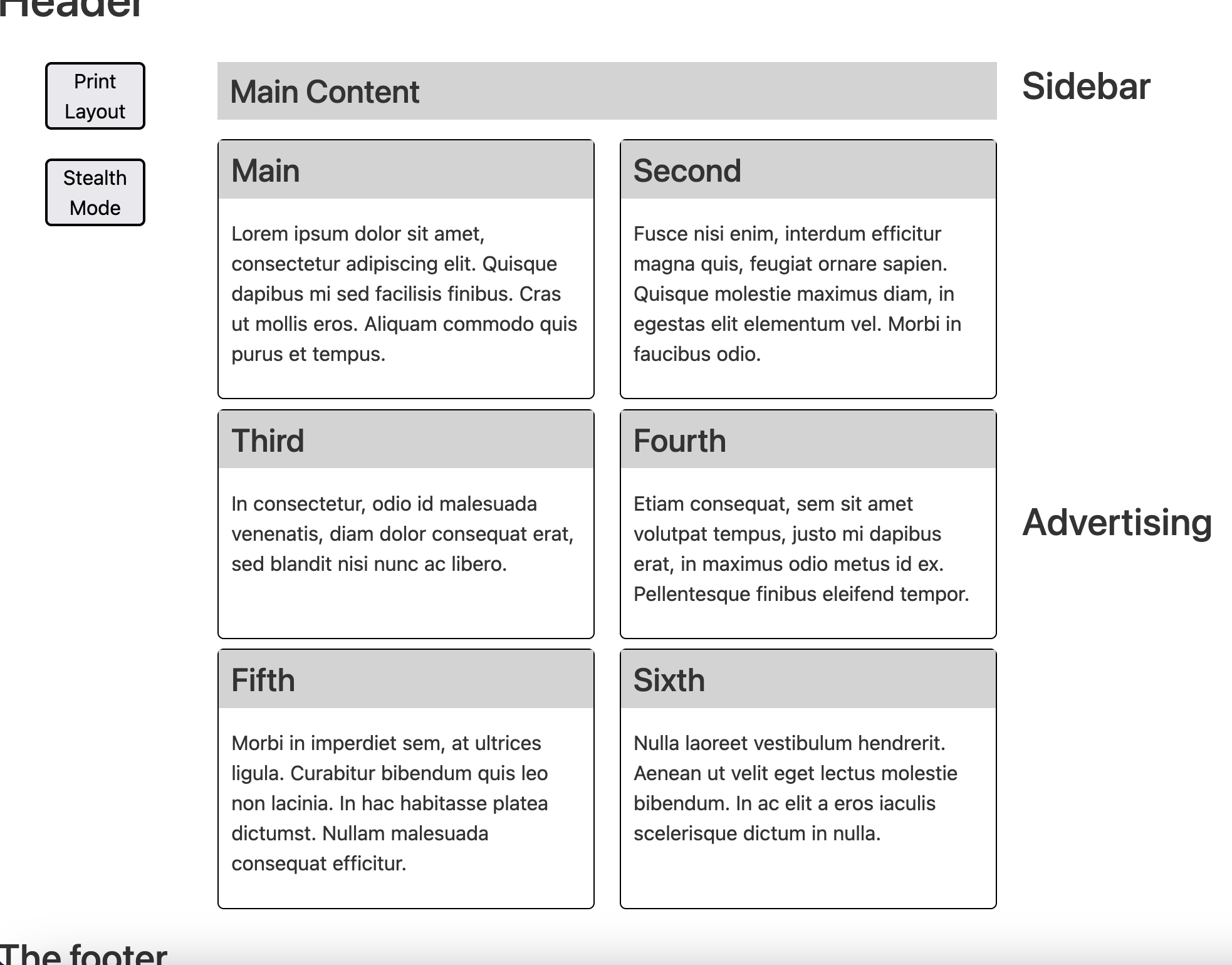
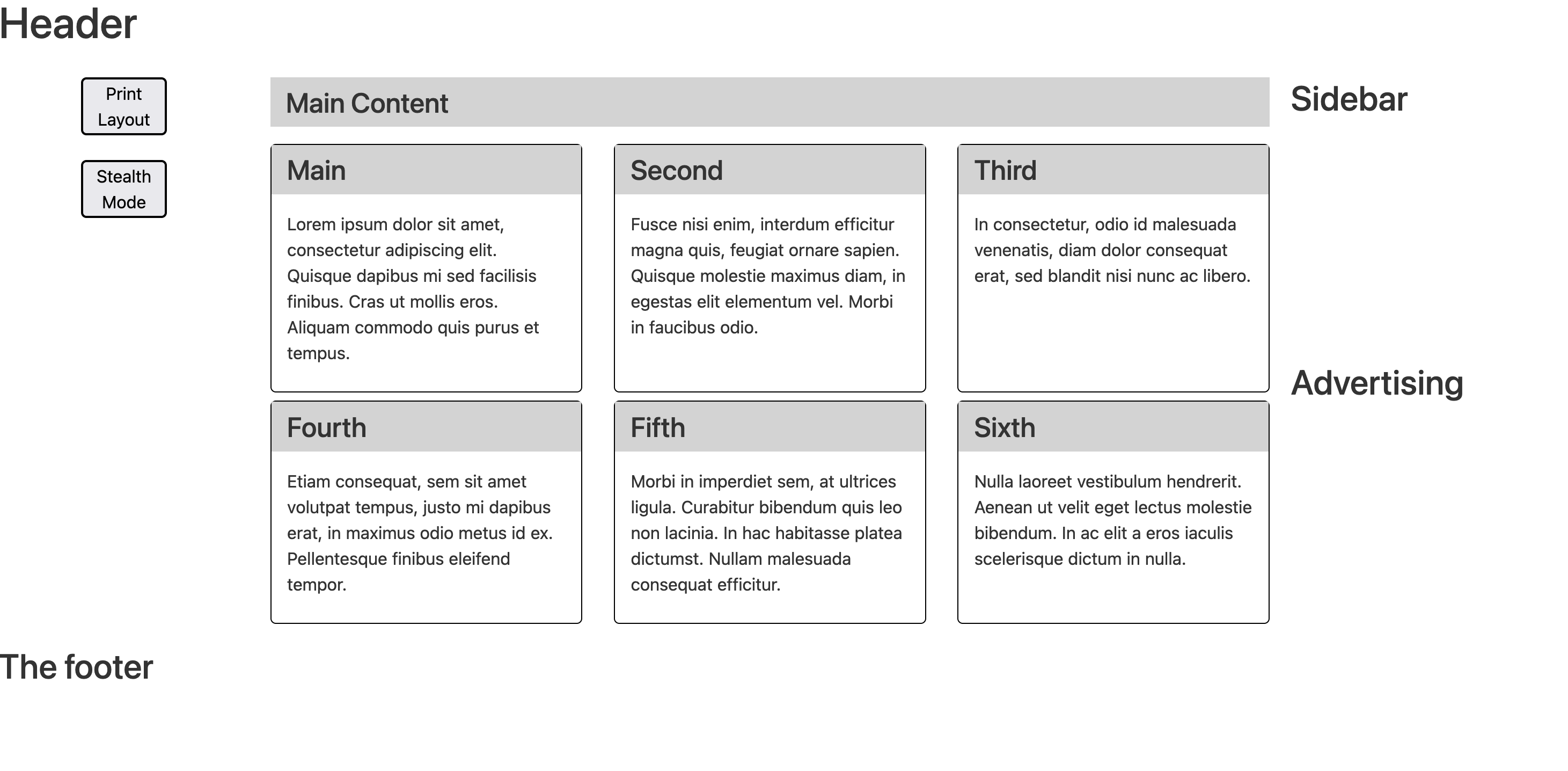
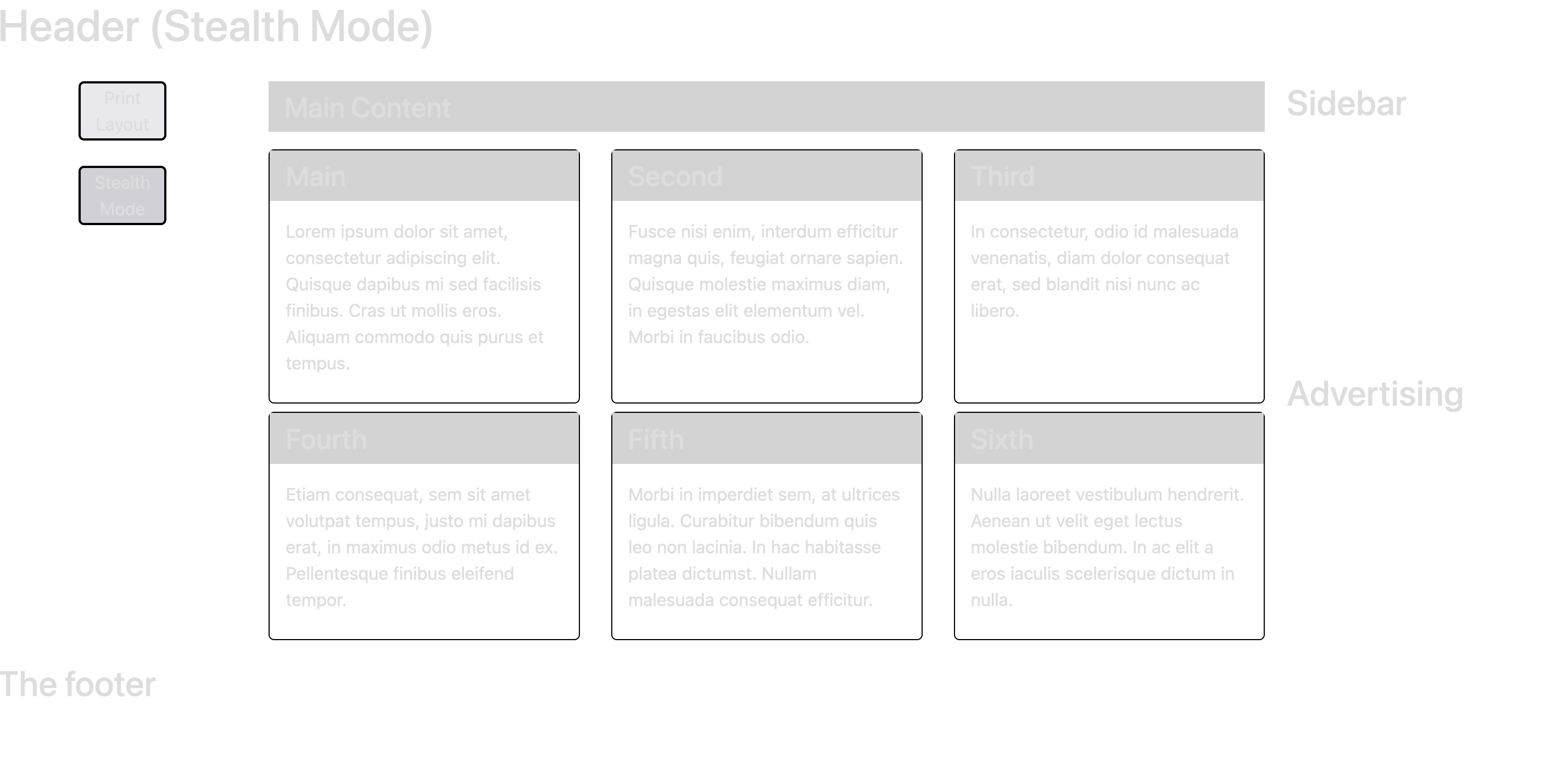
Nested Layout
We now have a general structure for the whole page, but now we want to create a
structure for the main content. To do this, we’ll create a grid inside a grid.
Open cards.css for this part of the lab.
- Create a mapping of
mainelements togrid-areas. You will need separate mappings for theh2and all six of thearticles. - Make the
mainelement into a grid. At this point, if you check the tiny and small layouts, the content becomes a jumbled mess. Create a media query for these layouts to restore the original structure, with theh2element at the top followed by the sixarticles in a column. - Create a 2-column layout for medium screens. Both columns should be the
same width.
- You can confirm your medium grid matches the expected version.
- Similarly, create a 3-column layout for large screens.
- Again, confirm your large grid matches the expected version.
- If you try to print the page again, you’ll see that making the
maininto a grid messed up that layout again.- Create a
printmedia query to convert themaininto a flex-box. - Make the articles into a column with space between them vertically.
- Eliminate the vertical padding inside the
h3andpelements in thearticles. - Remove the
mainh2from the display. - Confirm that your print formatting looks correct.
- Create a
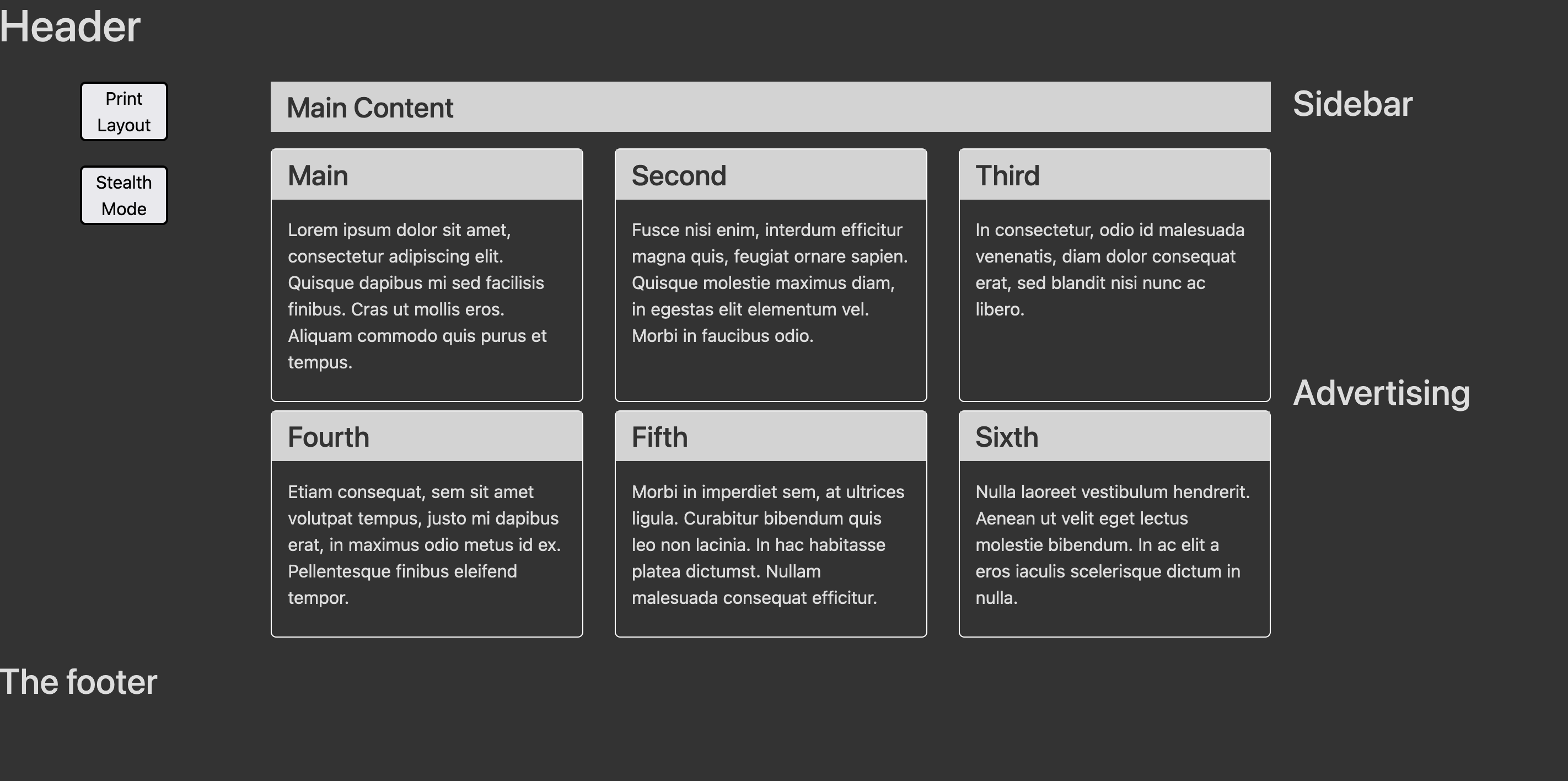
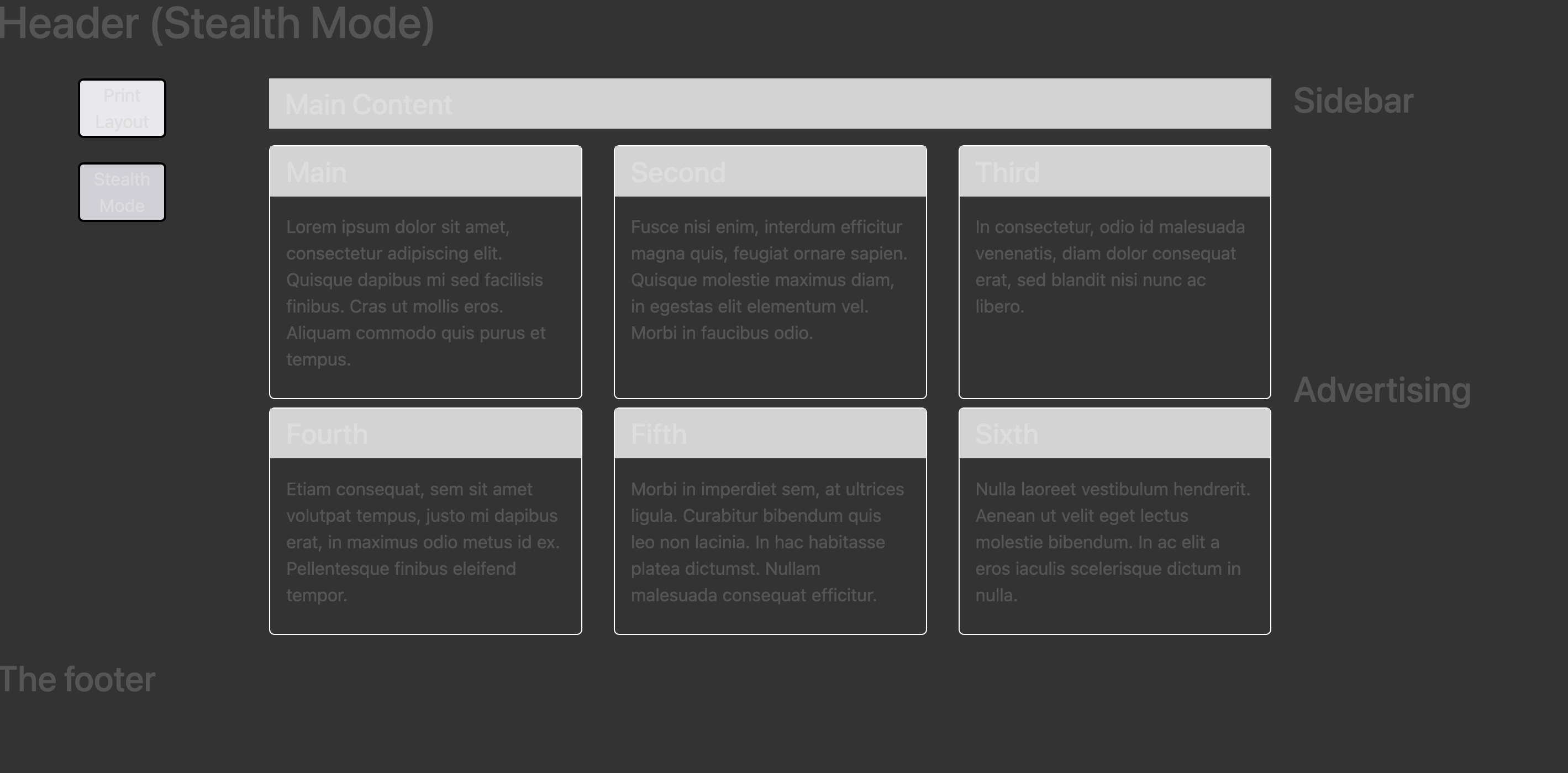
Dark and Stealth Mode
Now that we’ve got the layout, let’s take advantage of a popular feature of
modern browsers: dark mode! For this, we’re going to start in dark.css.
We’re also going to (intentionally) break accessibility rules to make the
text harder to read. Let’s call this “stealth mode”.
- Open the
index.htmland addclass="stealth"to thebody. - In
dark.css, create a new rule for the.stealthclass that makes the text use thelightcolor variable.- Reloading the page should make it look like an unreadable mess.
- Get rid of the
class="stealth"from thebodyso we can move on to dark mode.
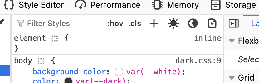
Dark mode depends on a prefers-color-scheme: dark media query. (You can also
make one specifically for light mode.)
- Add a dark mode media query that changes the color scheme based on
the comments in the file.
- In your browser, you will need to change your color scheme preferences. The easiest way to test this is to use Firefox. Open the inspector and click on the icon that looks like a crescent moon to turn dark mode on and off.
- Check your progress again to make sure it looks right.
- While we’re at it, add rules for the
.stealthclass inside the dark mode media query.- After adding the
class="stealth"back to yourindex.htmlbody, you can check your progress again.
- After adding the
Event Listeners
So far, we’ve been relying on CSS media queries for everything. For the last
part here, let’s use JavaScript to change some things. Open script.js to
make the following changes:
- Get the
#mode-printelement and add a click event listener.- Calling
window.print()will pull up the system dialog to print the page, but… - We cannot just put
window.printas the event listener’s callback function. Instead, create an arrow function that takes no parameters and callswindow.print(). (I.e.,() => window.print())
- Calling
- Similarly, add an event listener for the
#theme-stealthbutton.- In the body of this function (you can either create a callback
function or use another arrow) add/remove the string
" (Stealth Mode)"to theheaderh1element. - Similarly, add/remove the
.stealthclass to thebody.
- In the body of this function (you can either create a callback
function or use another arrow) add/remove the string
🤔 What's the point?
What’s the point of creating something as unusable as stealth mode? Good question! It’s really not something you’d ever want to do. The main purpose here was to demonstrate the interaction between adding/removing CSS classes with JavaScript and the browser’s light/dark mode features. In the future, we recommend you only choose good color schemes instead of unreadable messes.Going Further
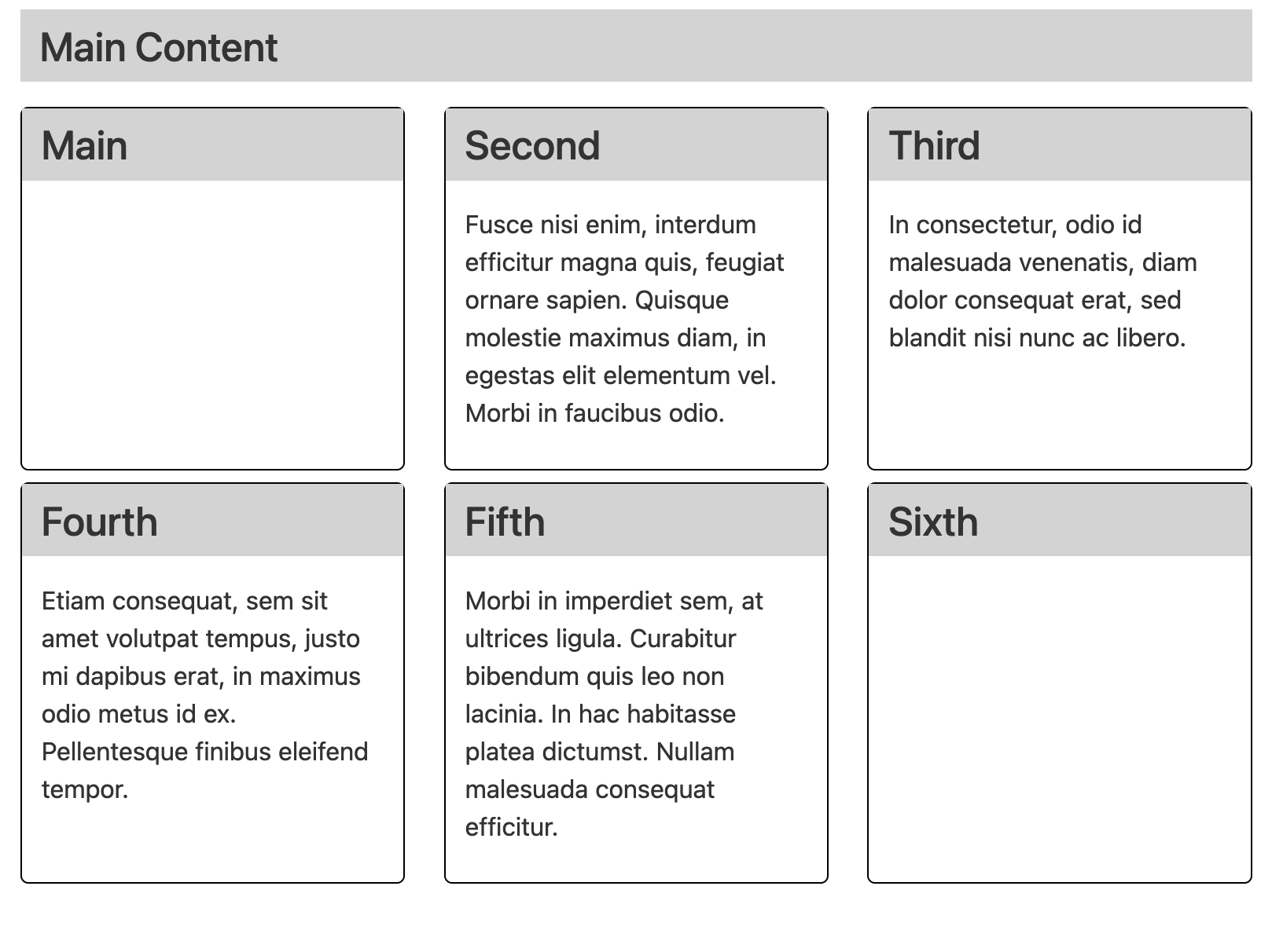
Now that we’re starting to use JavaScript to manipulate the DOM, let’s try one more thing: make stuff disappear.
- In
script.js, get all of thearticleh3elements. - Loop through each
articletitle and add a click event listener.- Use an arrow function like before, but this time use a parameter
to get the
event. You can call it whatever you want, but it’s common to use(e) => { ... }or(ev) => { ... }. - In the event model, the thing that you clicked on is the event’s
“target”. We can access this using
e.targetin the arrow function. - From the target (the
h3element clicked), traverse the DOM tree to get thepelement that immediately follows it. There are a couple ways to do this. You could useparentNodeon theh3to get the parent, then accesschildNodesto get the appropriate child. You could also just usenextElementSiblingon theh3node to get the sibling. - Once you have the
pelement (you can print it usingconsole.logto make sure), toggle itshiddenproperty.
- Use an arrow function like before, but this time use a parameter
to get the
If you click on the Main and Sixth titles, you should see these results.